Incode Studio lets you style the verification experience your users see. Set colors, a logo, and button corner radius, preview the real screens as you make changes, and launch the result from Dashboard. To start customizing, see Customize with Studio.
Info
Studio replaces the CSS Customization tab for accounts on UXv2. See CSS Customization to Incode Studio for migration information.
Before you start
Four things determine whether Studio applies to you:
- UXv2: Studio is available for accounts on UXv2 only. When Studio is active, it replaces the CSS Customization tab.
- Enabled for your account: Incode turns on Studio for your account. Contact your Incode representative to confirm that Studio is available to you.
- One theme per Client ID: Studio applies one default theme to each Client ID. Themes per Flow, themes per Workflow, and multiple named themes in one account are not currently supported.
- SDK version: Older SDK versions ignore settings they do not support. See Studio SDK version compatibility.
Studio layout
Header

- Module selector: Selects the module whose screens appear in the preview. Your customization applies to all modules.
- Undo and Redo: Reverts or reapplies your recent changes.
- Unsaved changes: Appears when you have changes that you have not saved.
- Save as draft: Saves your current changes without delivering them to your users.
- Launch: Delivers your customization to your users. See Launch your customization.
- Version history: Opens version history.
Preview
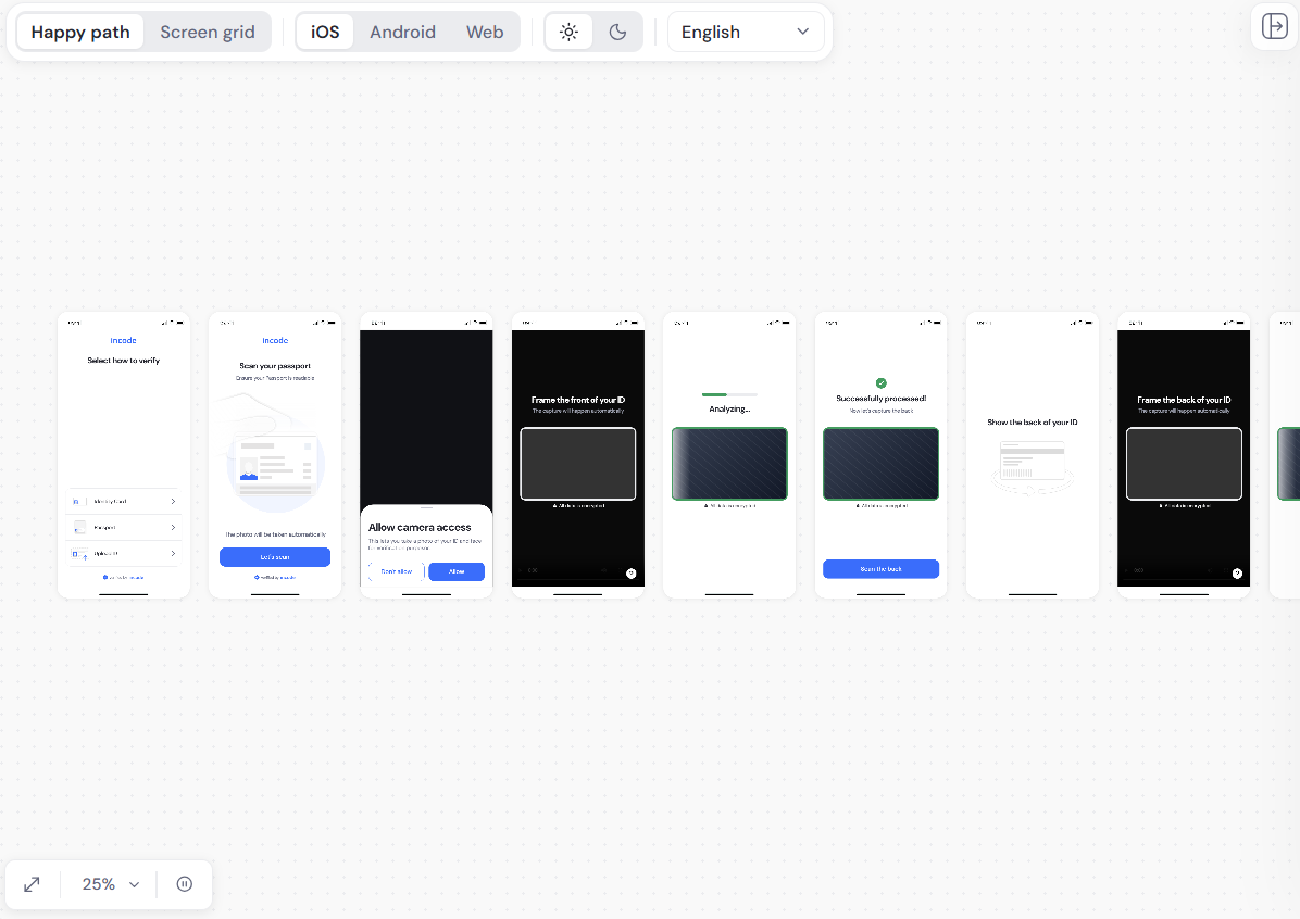
The preview shows the screens your users see. Use the controls at the top to change what you see:
- Happy path: Shows the screens in the order a user sees them during a successful flow.
- Screen grid: Shows all screens based on their category.
- iOS, Android, and Web: Shows the experience on each platform.
- Light and dark: Shows the experience in each display mode.
- Language: Shows the screens in the selected language.
Use the controls at the bottom left of the preview to fit the preview to your screen, change the zoom level, and pause screen animations.
Customization panel
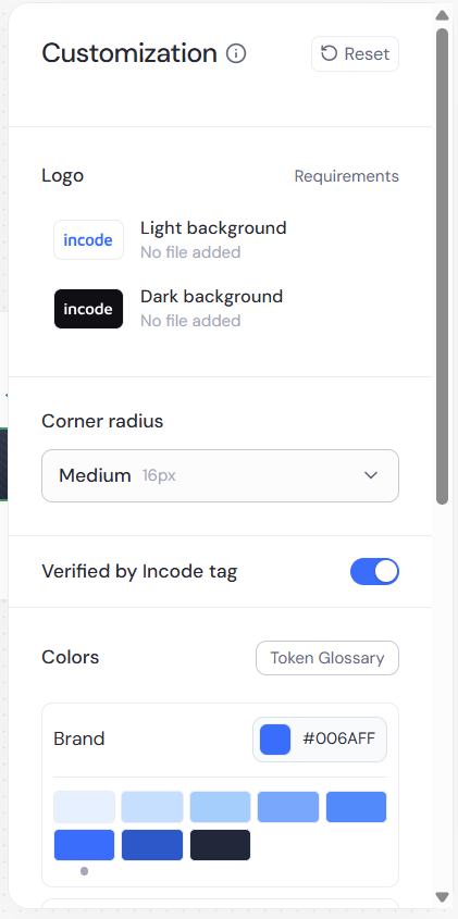
The Customization panel contains the settings that change how your screens look. For descriptions of each setting, see What you can customize. Click Reset to return the settings to their defaults.
Version history panel
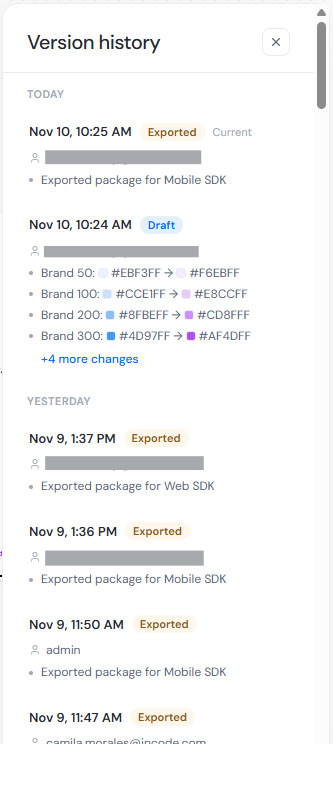
Version history records your saves, launches, and exports. Exports note the package type, entries that record setting changes list each change, down to the individual color. When you preview an earlier version, a banner replaces the header and the preview is read-only. To go back to an earlier version, see Restore an earlier version.
Current limitations
Studio does not currently customize the following:
- Typography
- Layout and alignment
- Illustrations and other asset replacement
- Localization and text overrides
- Themes per Flow or per Workflow
- More than one named theme per Client ID
- UXv1 experiences
Troubleshooting
I launched and nothing changed in my app
If your users reach the flow through your app, you are on the SDK path. Launching never changes an app that is already installed. Download the package, add it to your project, and ship an app release.
My customization is saved, but it does not apply
Check which SDK version your users run. A version that predates a setting ignores it. Studio shows the minimum SDK version for each platform when you select your SDKs. For more information, see Studio SDK version compatibility.
It does not look exactly like my old CSS
UXv2 is token based and does not run arbitrary CSS, so a heavily customized CSS experience looks different. See Migrate from CSS customization to Studio.
An element does not follow the color I set
Some elements do not follow a color setting. Open the Token Glossary in the Colors section and look for the element in the group you changed. If no token lists the element, no color setting currently controls it. See Token Glossary.