
Manual Upload ID V1 vs V2 Comparison
In V1, Manual Upload ID offers a basic experience for submitting identity document photos from a device. The flow covers the essential steps but provides limited guidance, and UI elements are not tokenized, which makes customization difficult and limits the ability to align the experience with your brand.
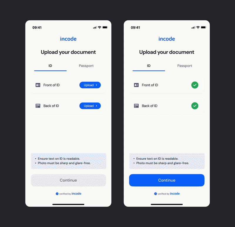
In V2, Manual Upload ID focuses on clarity and confidence. The flow guides users through document type selection and per-side upload with inline validation feedback, image quality hints, and a disabled Continue button that activates only once all required sides are validated — resulting in a simpler, more direct experience.
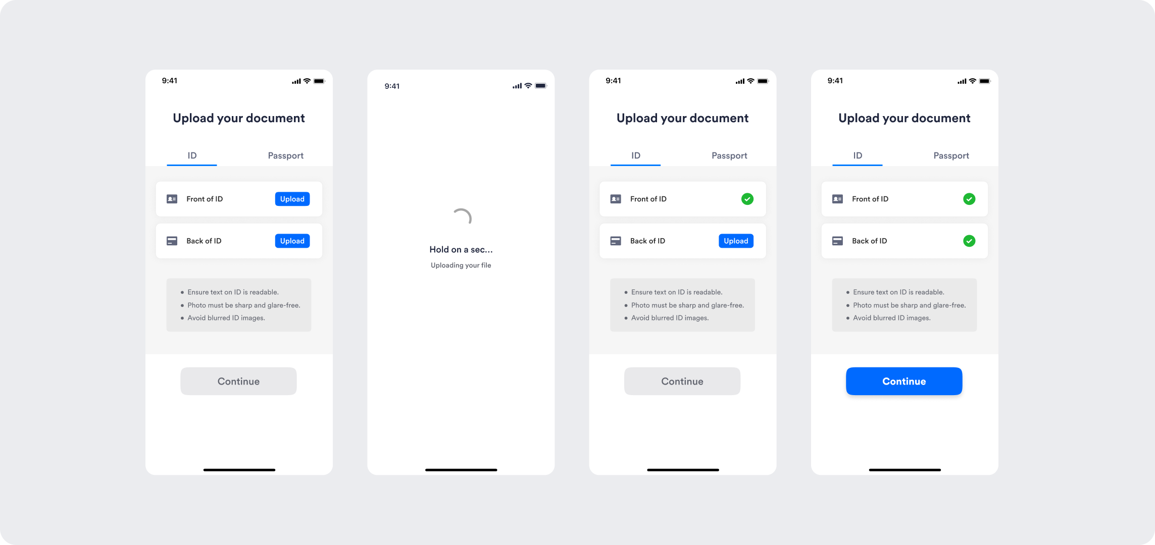
V1 is a basic upload experience with limited guidance and no tokenized customization.
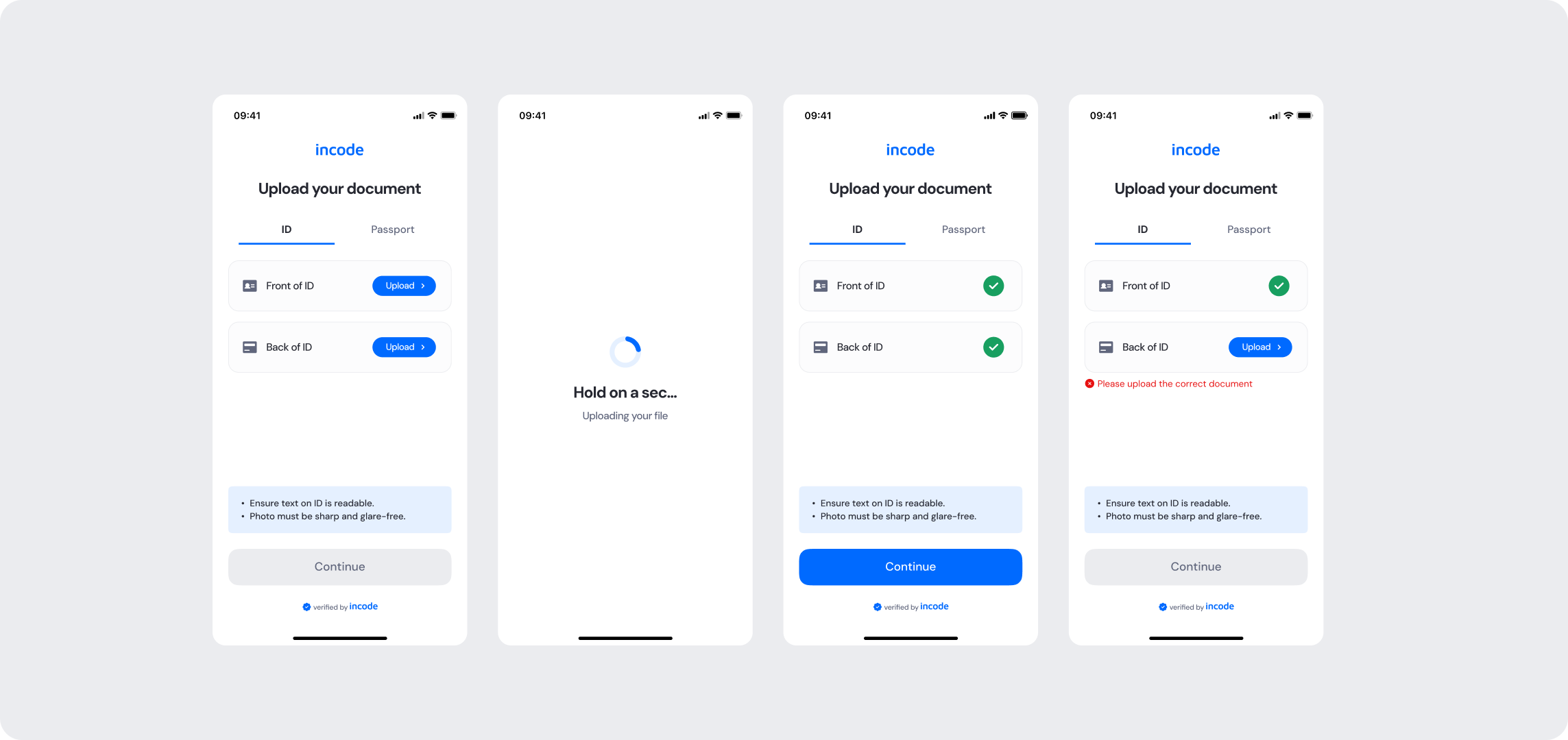
V2 is a refined upload experience with clear per-side validation, inline error feedback, image quality hints, and full token-based customization.
Feature Comparison
Functional capabilities of the module (objective features only; no UX or performance differences).
| Capabilities | V1 | V2 | Notes |
|---|---|---|---|
| Document upload | ✅ | ✅ | Both versions allow the user to upload identity documents from their device. |
| Document type selection | ✅ | ✅ | Both versions support selecting between document types such as ID and Passport. |
| Per-side upload tracking | ✅ | ✅ | Both versions require the front and back sides to be uploaded separately. |
| Image quality hints | ✅ | ✅ | Both versions display guidance to help users submit files that can be processed correctly. |
| Inline validation feedback | ❌ | ✅ | V2 displays immediate inline error messages when an incorrect document is uploaded, allowing the user to correct it without leaving the screen. |
| Continue button disabled state | ✅ | ✅ | Both versions prevent advancing until all required sides are validated. |
| Error States | ✅ | ✅ | Both versions cover general error cases that users can encounter. |
| Customization options | ❌ | ✅ | V1 provides limited customization options, while V2 allows full control over text, colors, buttons, illustrations, and behavior. |
| Documentation completeness | ❌ | ✅ | V2 provides complete, standardized documentation coverage. |
Behavior Differences
How the module behaves during runtime.
| Behavior | V1 | V2 | Notes |
|---|---|---|---|
| Upload interface | Basic file picker with no additional guidance per side | Structured upload interface with document type tabs, per-side upload prompts, and image quality hints | V2 gives users clear context for each required document side, reducing submission errors. |
| Validation feedback | Basic error states with no inline guidance | Immediate inline error message directly below the affected upload row when an incorrect file is detected | V2 actively communicates upload issues so users can correct them without leaving the screen. |
| Continue button behavior | Disabled until all sides are uploaded | Disabled until all sides are uploaded and validated, with clear visual differentiation between disabled and active states | V2 makes the button state more predictable and visually consistent with the UXv2 system. |
| State transitions | Default transitions | Specifically designed screen-by-screen transitions for smoothness | V2 includes transition guidelines as part of the module documentation package. |
Customization Overview
Customization in V2 is significantly simpler and more consistent across modules.
Customizing the experience to match your brand is simpler in V2
Instead of having isolated configuration options per screen or component, V2 uses a unified token-based system that allows developers to control visuals, behaviors, and experience patterns with fewer parameters and predictable outcomes.
This means:
- Less engineering work to override UI elements
- Consistent branding across modules
- Predictable behavior when changing settings
- Reduced risk of breaking flows
- Clear separation between visual tokens and experience configuration
V2 also centralizes all customization options under a single structure, so developers always know where to look and what they can modify. This includes button styles, tab indicator colors, upload row appearance, inline error styling, and the overall visual theme — making it straightforward to align the module with your brand without affecting core upload and validation logic.
For full details, visit the Customization tab of this module.
Updated about 1 month ago