
Screens & States
of Email Input module
A complete view of all screens the user may encounter during the Email Input module experience. Each state includes a brief description.
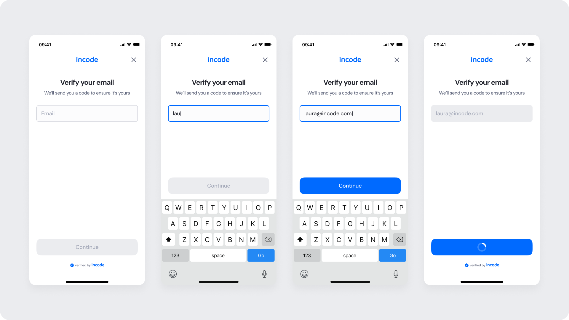
Enter Email
Guides the user from an empty field to a valid email and into submission. The Continue button is disabled until a valid format is detected; it activates once validation passes. While submitting, the button shows a loading state to prevent duplicate requests.
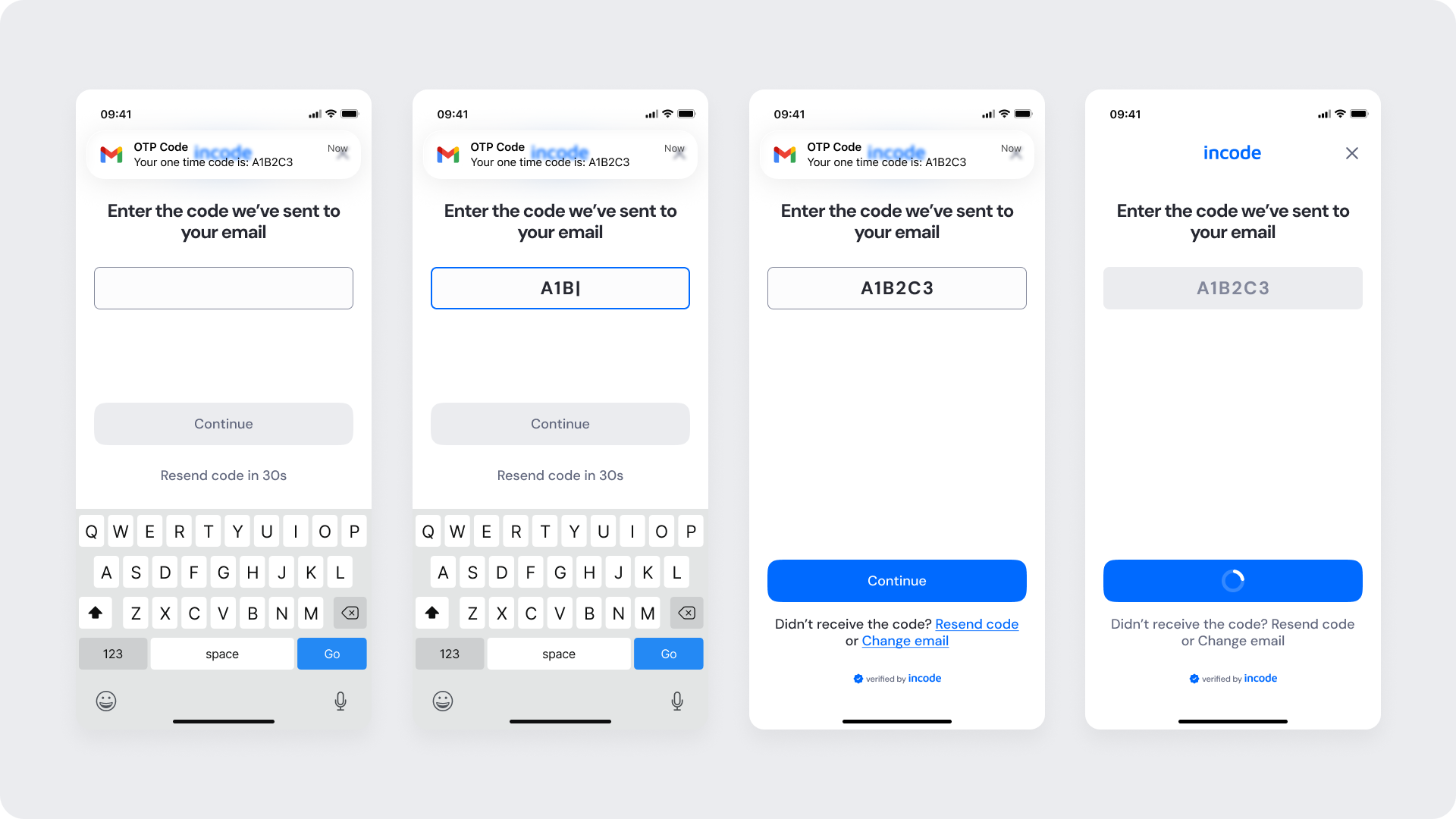
Enter Code (OTP Input)
Displayed after the user submits an email. The system sends an SMS with a one-time code, and this screen prompts the user to enter it. A countdown timer indicates when the “Resend code” option becomes available.
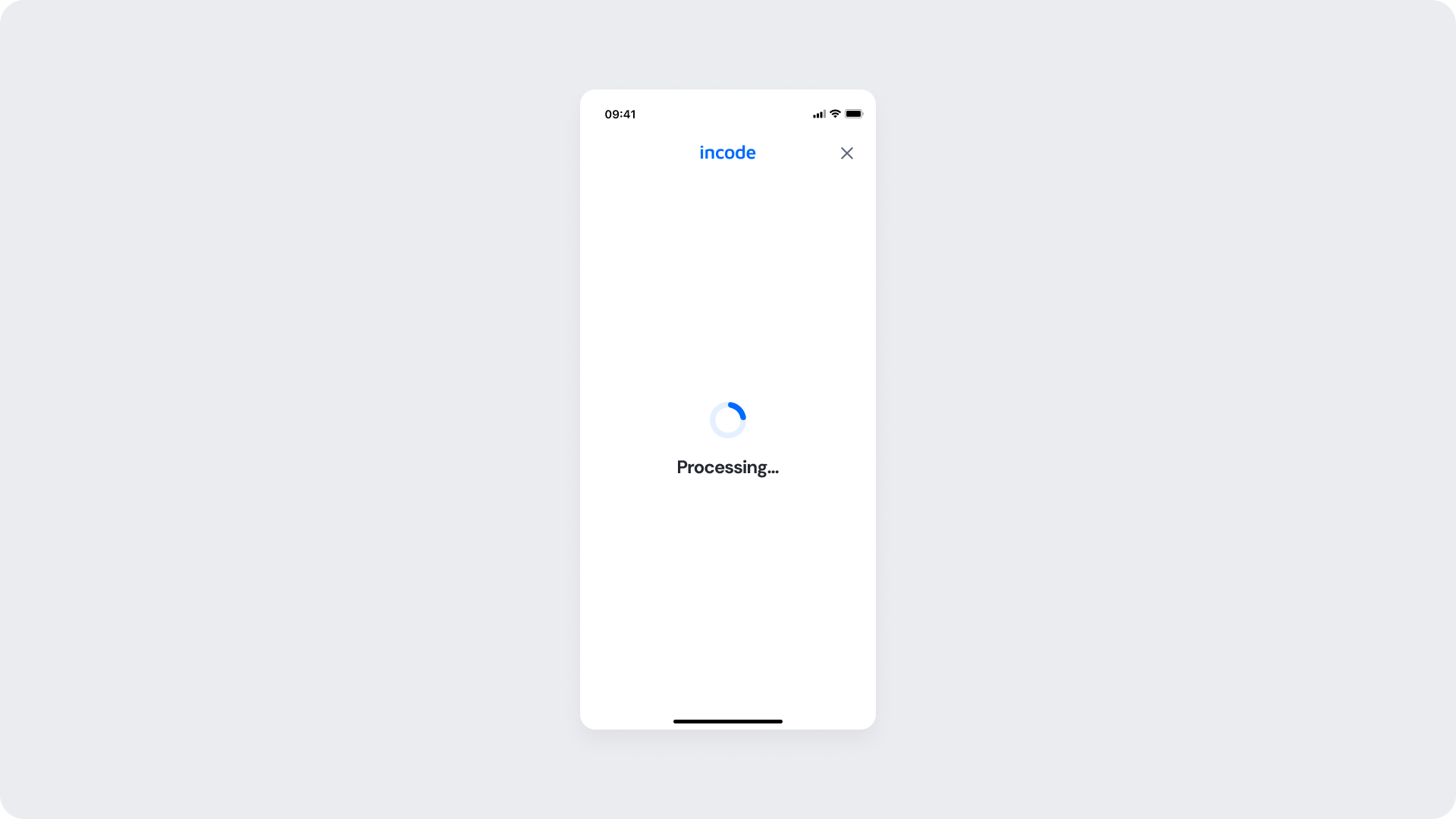
Processing
A short step after the OTP is submitted. Spinner + status text communicates progress while preventing multiple submissions. This state should be brief and non-interruptible (except for closing the module, if allowed by host app).
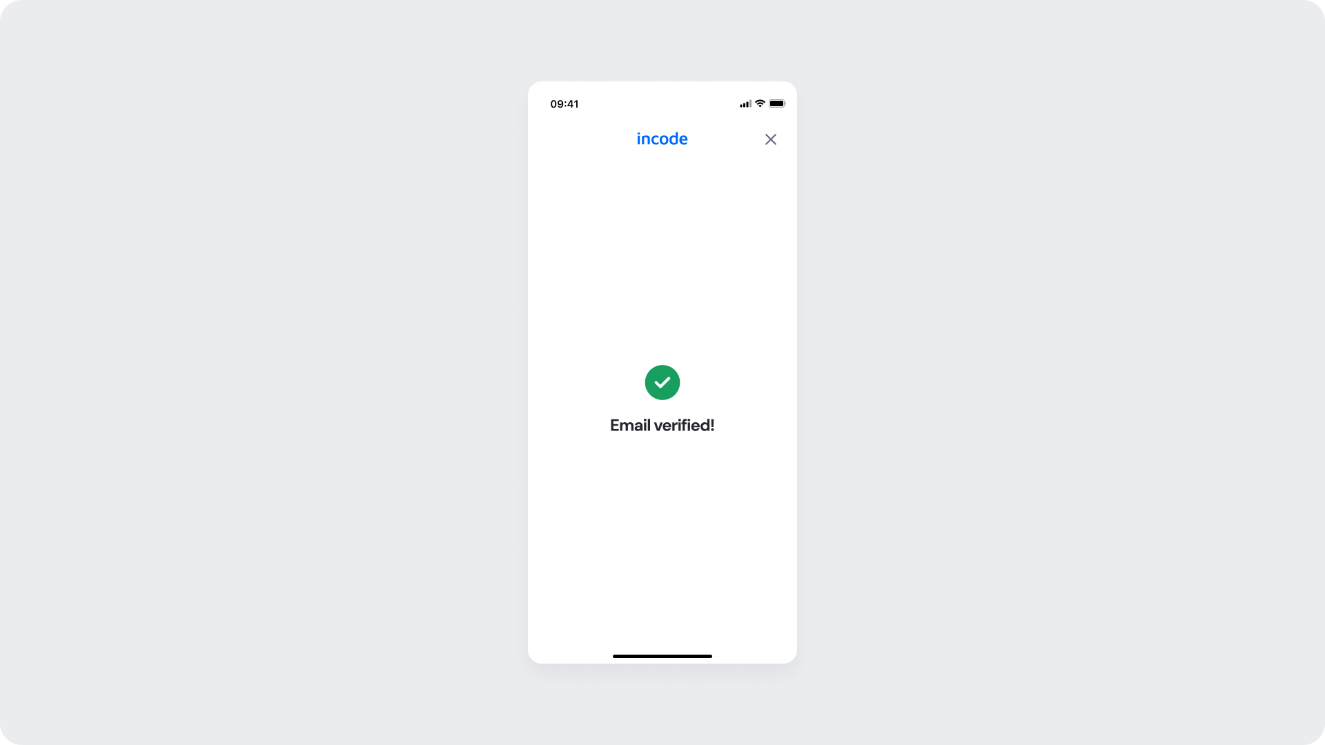
Success
Confirms verification with a positive icon and concise message (Email verified!). Automatically progresses to the next module or returns control to the host app per integration settings.
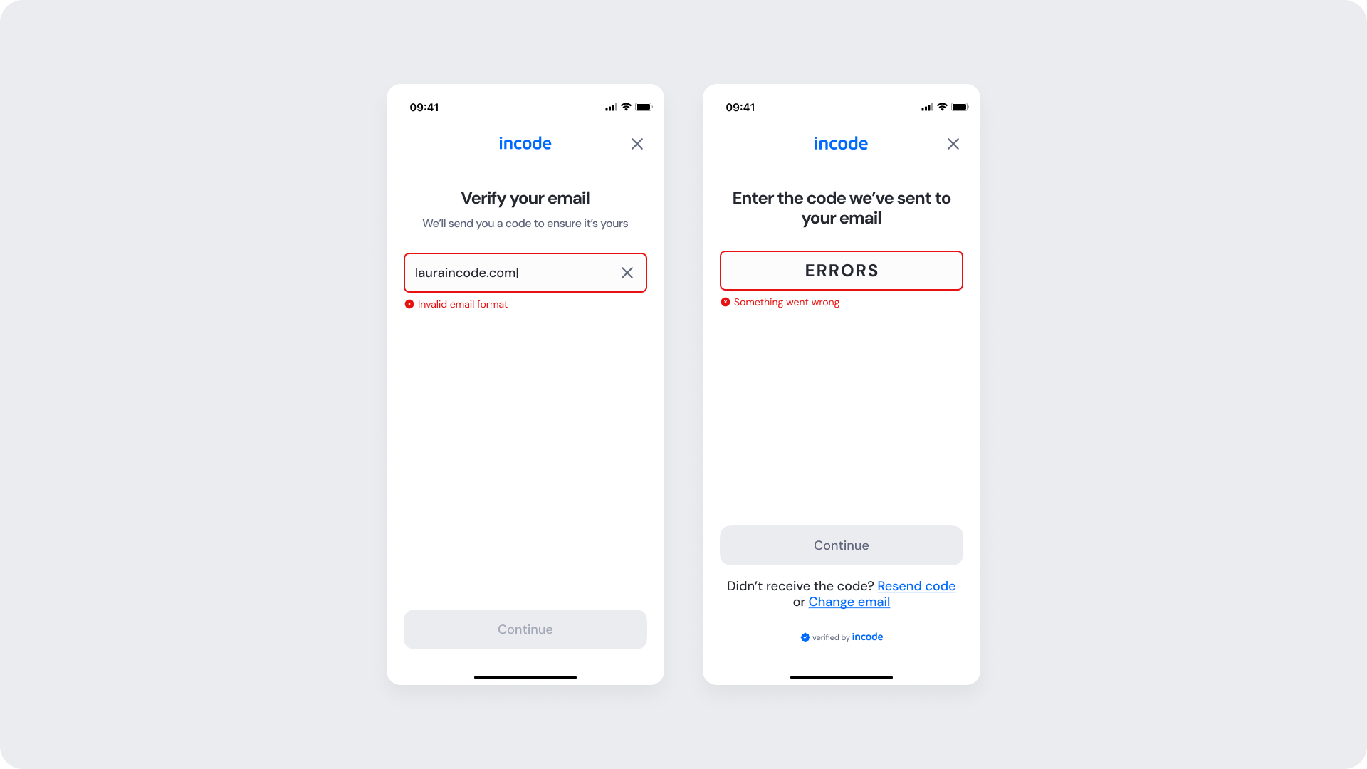
Error States (Email & OTP)
Covers common failures:
- Invalid email format (inline helper text; button remains disabled)
- Incorrect code (inputs marked, helper text provided)
- Code expired (inputs marked, helper text provided)
Recovery affordances (Resend code, Change email) remain visible. Copy is intentionally brief to avoid over-explaining and reduce the risk of aiding malicious testing.
Updated 3 months ago