
Specs & Guidelines
of Phone Number Input module
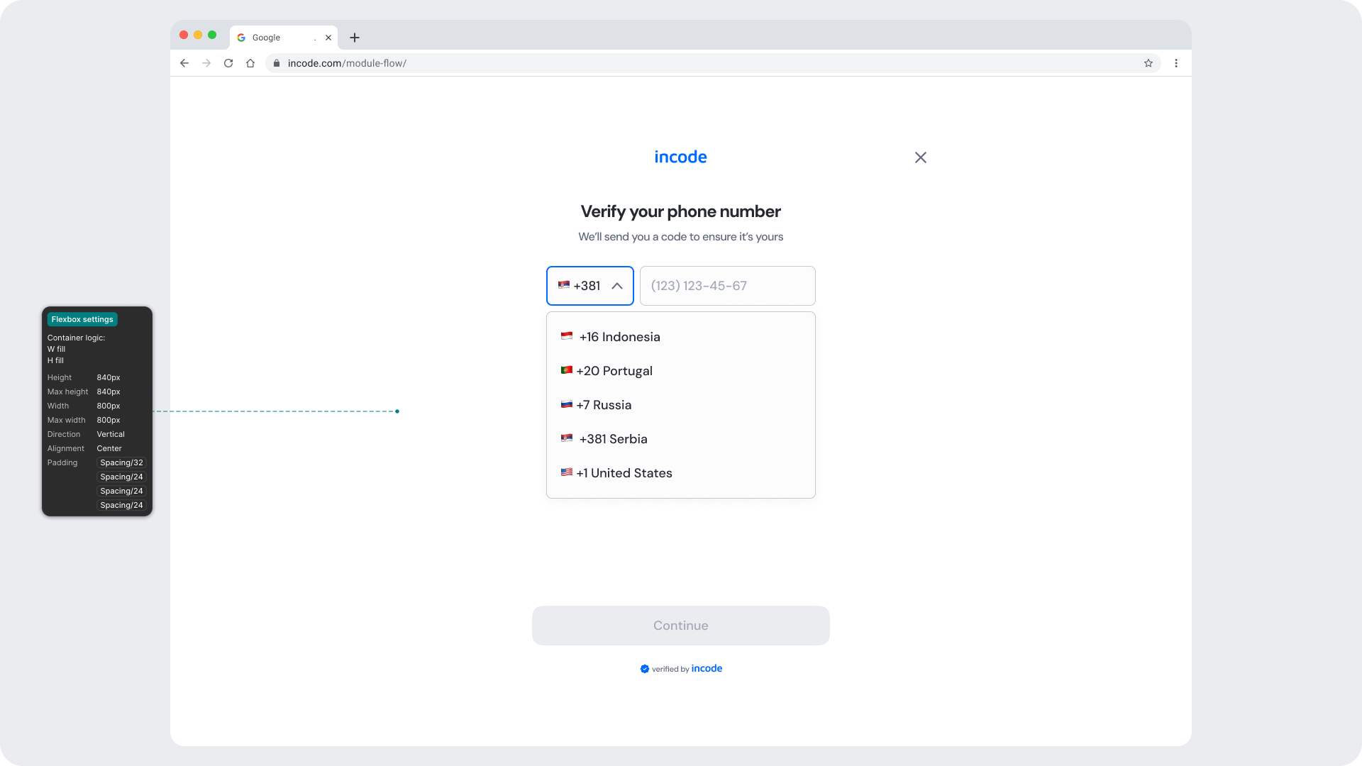
The Phone Number Input module includes complete Figma specifications documenting spacing, layout rules, typography tokens, and language variants. These specs ensure consistency across platforms and allow localized versions of the UI to scale without breaking the layout.

Responsiveness & Viewport Adaptation
The Phone Number Input module is fully responsive and adapts seamlessly to a wide range of device sizes and aspect ratios. The layout is designed to remain consistent and predictable whether the user is on a small phone, large phone, foldable device, or tablet.
This ensures that key interactive areas, such as the input area, country selector, and primary CTA always remain visible and reachable without requiring scrolling or zooming.
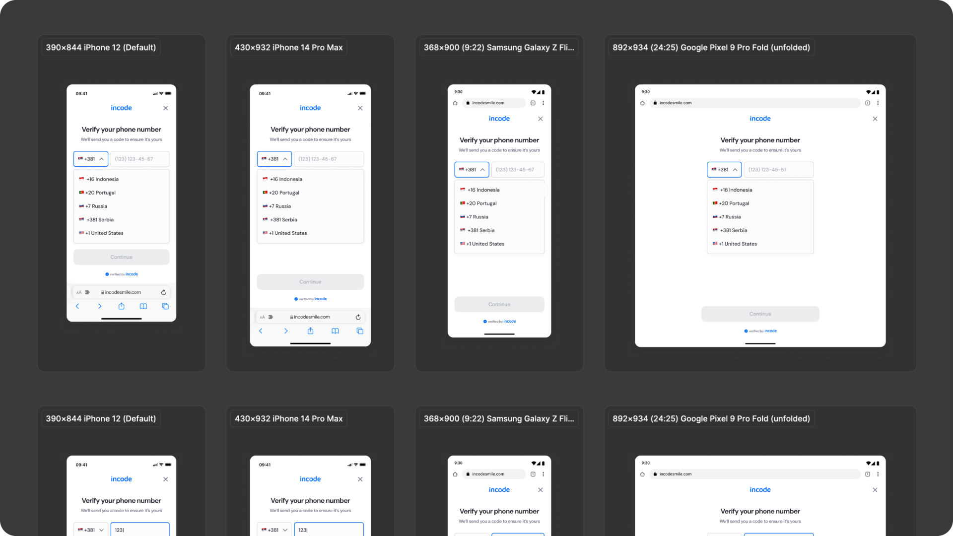
How the layout adapts across devices
| Breakpoint | Behavior |
|---|---|
| Small phones (e.g., iPhone SE) | Components stack vertically; country selector and input field scale slightly |
| Standard phones (iPhone 12–16) | Full layout displayed with consistent spacing and button hierarchy |
| Tall/narrow Android devices | Vertical spacing adjusts dynamically to maintain visual balance |
| Foldables (e.g., Pixel Fold) | Input group stays centered; margins expand symmetrically |
| Tablets | Wider margins with proportional input scaling; buttons stay centered |
| Desktop web | Content is centered with fixed max-width and extended safe padding |
What is responsive (and customizable)
| Element | Responsive Behavior | Customizable |
|---|---|---|
| Input field & label | Scale and align based on viewport width | Border, color, placeholder |
| Country selector | Expands in width proportionally to maintain spacing | Icon, surface, border color |
| Buttons | Width adjusts; spacing below inputs adapts | Color & text |
| Countdown text | Reflows beneath inputs; stays visible on all devices | Yes, fully localizable |
| Footer / watermark | Pinned to bottom safe area | Optional |
| Background surfaces | Fill full viewport; safe padding adjusts per device | Yes |
| Header area | Padding and alignment scale with safe insets | Limited (color only) |
What remains fixed across breakpoints
| Element | Reason |
|---|---|
| OTP verification logic | Core function — must stay consistent |
| Input field proportions | Ensures usability and recognition consistency |
| Minimum text size | Maintains WCAG readability standards |
| Minimum tap target sizes | Accessibility requirement across devices |
| Layout hierarchy | Preserves visual predictability and rhythm |
Design Notes
- Input grouping (country code + phone field) should always be treated as a single logical component.
- Button placement remains consistent across states (focused, disabled, success) to maintain predictability.
- The module is built for fast entry — avoid introducing animations or long transitions between states.
- Keep vertical spacing consistent with other verification steps (e.g., OTP entry) to support modular flow design.
- Typography tokens ensure clear contrast and legibility even in dark mode; test brand overrides for sufficient color ratios.
Desktop & Tablet Guidelines
The module is fully responsive and adapts gracefully to larger viewports. The Figma file includes guidelines for layout adjustments, safe areas, proportion scaling, and interaction differences between touch and pointer-based devices.
Prototype & Transitions
Phone Number Input includes predefined transition rules and micro-interactions that ensure a smooth user experience. Animation guidelines are documented directly in Figma prototypes.
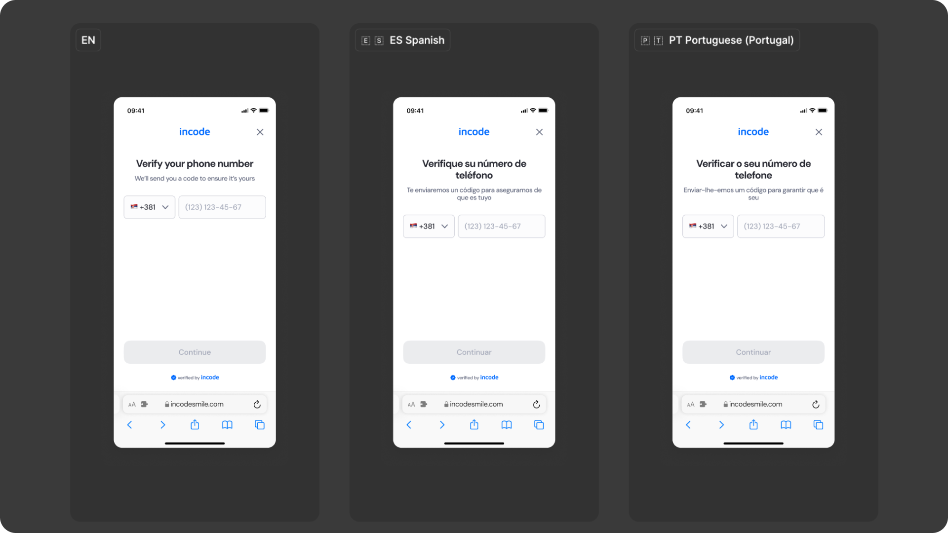
Localization
The Phone Number Input module supports full localization and is designed to adapt to languages with different lengths, line breaks, and reading patterns. The Figma file includes examples for long, short, and multi-line translations to ensure layouts remain stable across regions.
Key considerations
- All user-facing text (titles, labels, placeholders, buttons, countdowns) is fully localizable.
- Text element's width and padding flex to accommodate longer translations (e.g., German, Portuguese).
- Spacing tokens adjust dynamically to preserve vertical rhythm in longer translations.
Updated 3 months ago