This section outlines the elements you can customize within the CURP module to match your brand while preserving Incode’s core UX. It clarifies which areas are flexible, such as text, illustrations, and brand colors and which elements remain fixed to ensure consistency, accessibility, and optimal capture performance across platforms.
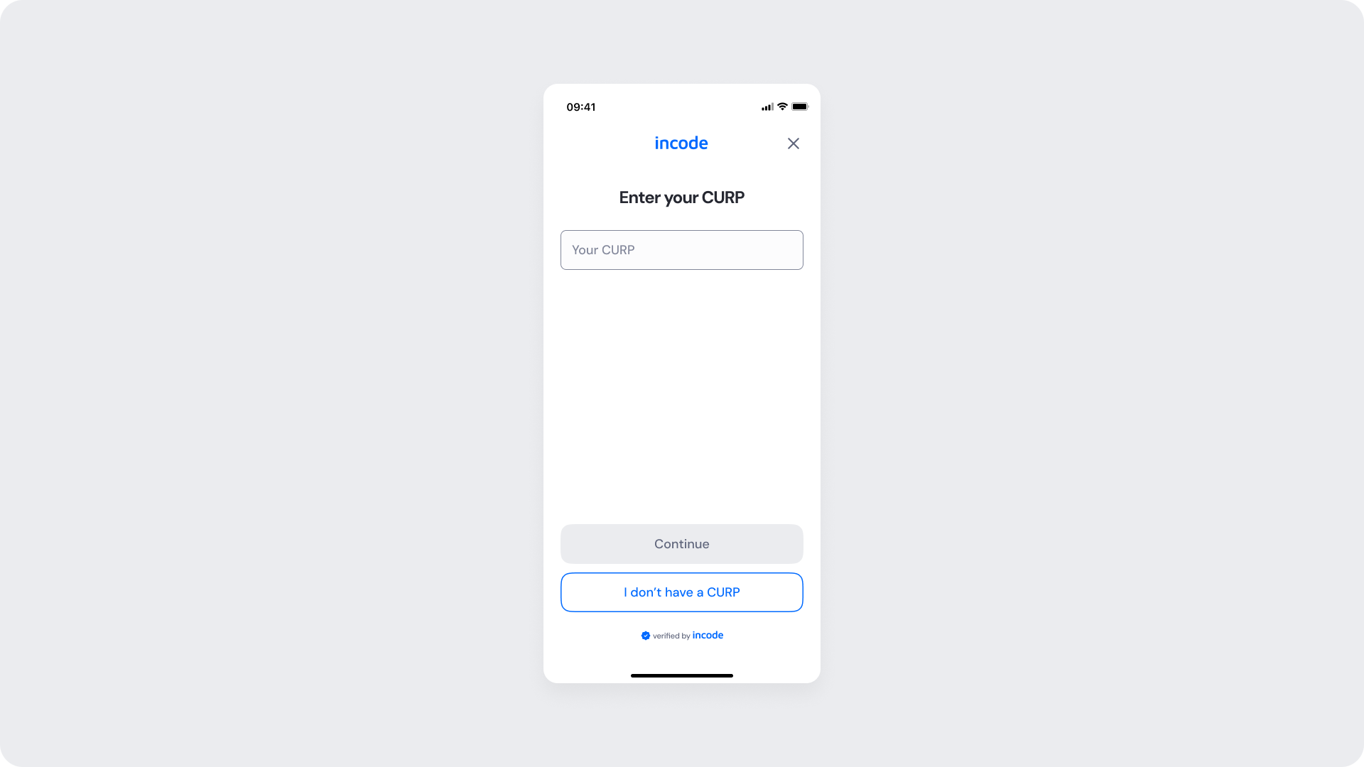
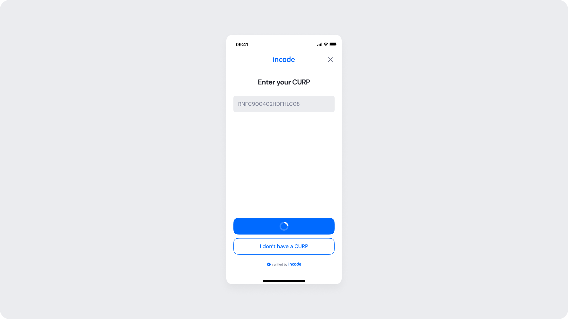
This screen appears when the CURP module is first presented to the user. It represents the initial state of the flow, shown before any input is entered.
The input field is empty and the primary action is disabled until a valid CURP is provided. An alternative path is available for users who do not have a CURP.
| Area | What can be customized | Notes |
|---|
| Text | Title, subtitle, button label | Fully localizable; tone can be adapted |
| Brand Colors | Illustration accent, button, header | Uses brand tokens |
| Buttons | Label, color | Must follow platform and WCAG standards |
| Element | Why it is fixed |
|---|
| Layout structure | Ensures consistency across onboarding modules |
| Spacing & safe areas | Required for device compatibility |
| Text hierarchy | Optimized for readability |
| Close icon position | Standardized for user familiarity |
| WCAG minimum contrast | Mandatory for accessibility compliance |
| UI Element | Token | Raw Value |
|---|
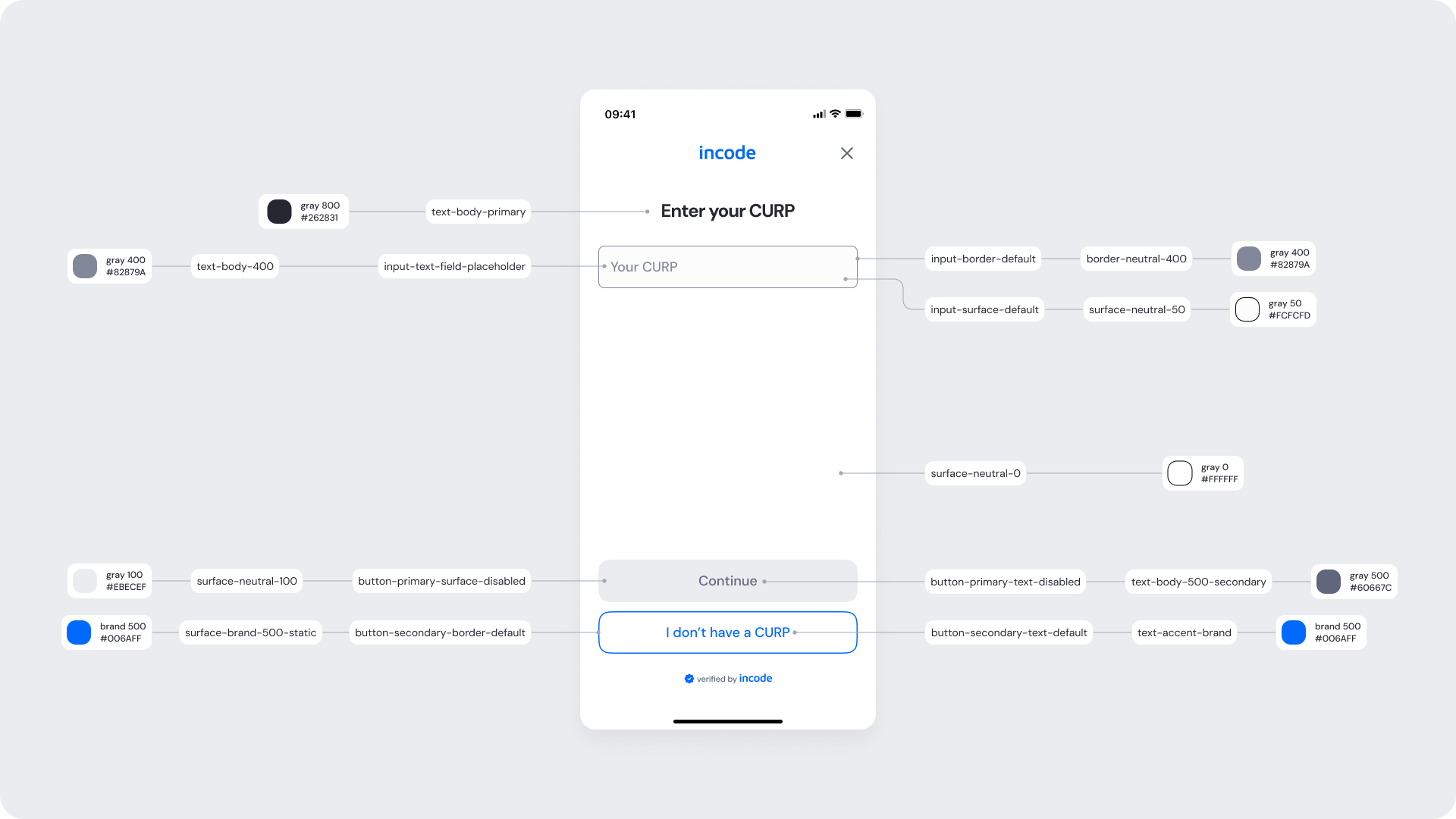
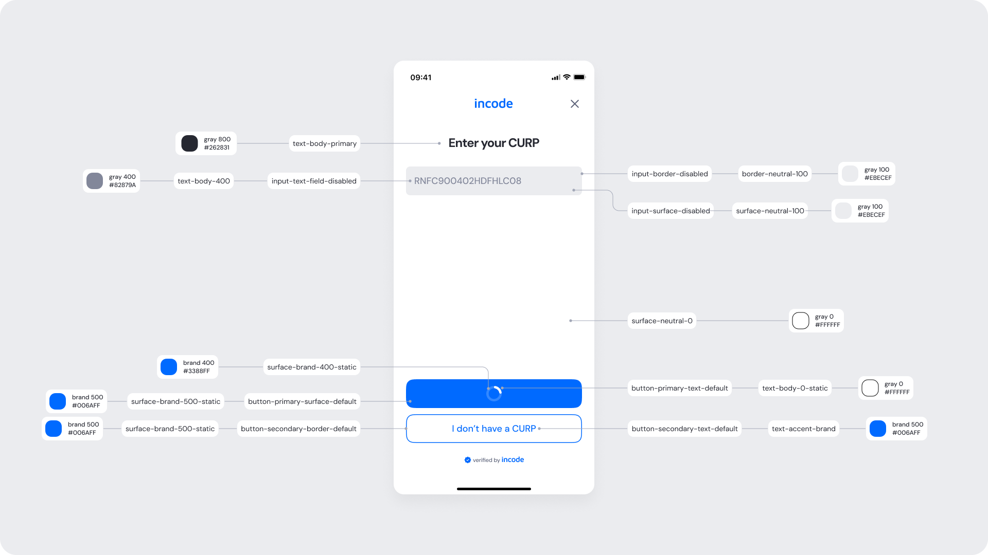
| Screen background | surface-neutral-0 | #FFFFFF |
| Title text (“Enter your CURP”) | text-body-primary | #262831 |
| Input background | input-surface-default | #FFFFFF |
| Input border (default) | input-border-default | #E5E7EB |
| Input placeholder text | input-text-field-placeholder | #9CA3AF |
| Input text (entered value) | text-body-primary | #262831 |
| Primary button background (disabled) | button-primary-surface-disabled | #E5E7EB |
| Primary button text (disabled) | button-primary-text-disabled | #9CA3AF |
| Secondary button border (“I don’t have a CURP”) | button-secondary-border-default | #006AFF |
| Secondary button text | button-secondary-text-default | #006AFF |
- Keep copy short to minimize cognitive load.
- Display the “verified by Incode” footer as a subtle trust signal while maintaining sufficient contrast for accessibility.
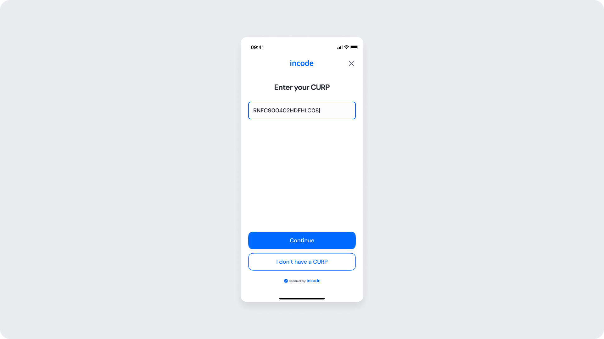
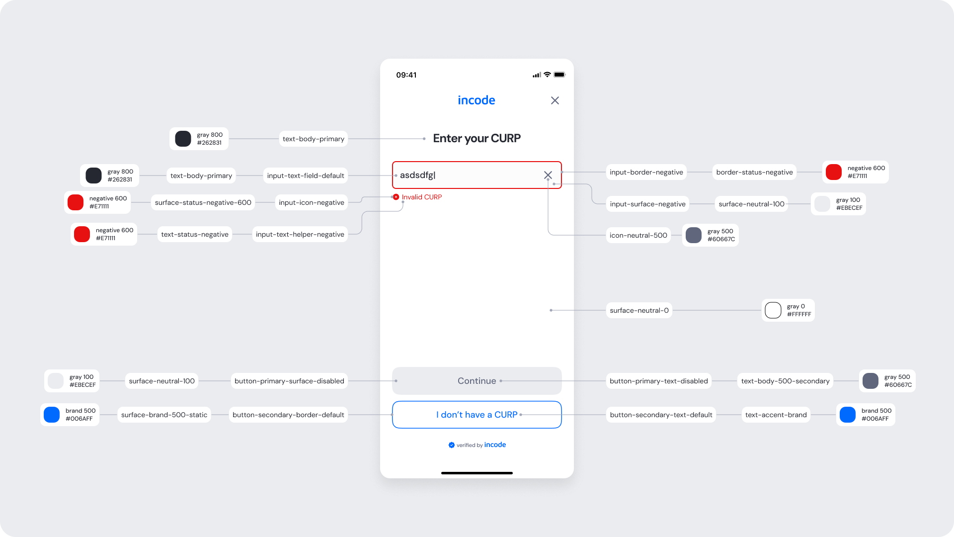
This state appears once the user has entered a complete and valid CURP. The input is confirmed visually, and the primary action is enabled, allowing the user to continue to the verification step.
| Area | What can be customized | Notes |
|---|
| Text | Title, subtitle, button labels | Fully localizable |
| Brand Colors | Buttons, links, highlight elements | Uses brand tokens |
| Buttons | Label, color | Must follow platform and WCAG standards |
| Element | Why it is fixed |
|---|
| Layout structure | Maintains visual continuity with other modules |
| Button spacing & placement | Optimized for tap targets |
| Text hierarchy | Follows global UX standards |
| Close icon position | Consistent across modules |
| WCAG minimum contrast | Required for readability and compliance |
| UI Element | Token | Raw Value |
|---|
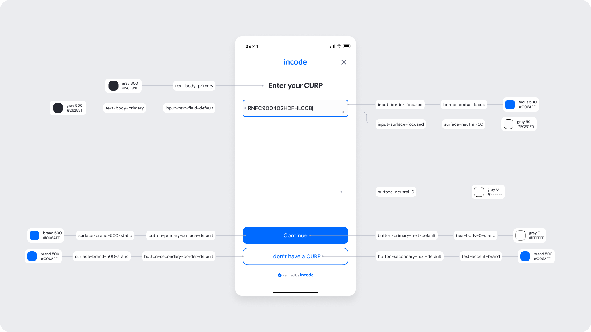
| Title text (“Enter your CURP”) | text-body-primary | #262831 |
| Input text (entered CURP) | input-text-field-default | #262831 |
| Input surface (focused) | input-surface-focused | #FCFCFD |
| Input border (focused) | input-border-focused / border-status-focus | #006AFF |
| Background | surface-neutral-0 | #FFFFFF |
| Primary button background (“Continue”) | button-primary-surface-default | #006AFF |
| Primary button text | button-primary-text-default | #FFFFFF |
| Secondary button border (“I don’t have a CURP”) | button-secondary-border-default | #006AFF |
| Secondary button text | button-secondary-text-default / text-accent-brand | #006AFF |
- Maintain a clear visual hierarchy between primary and secondary actions to guide user attention and decision-making.
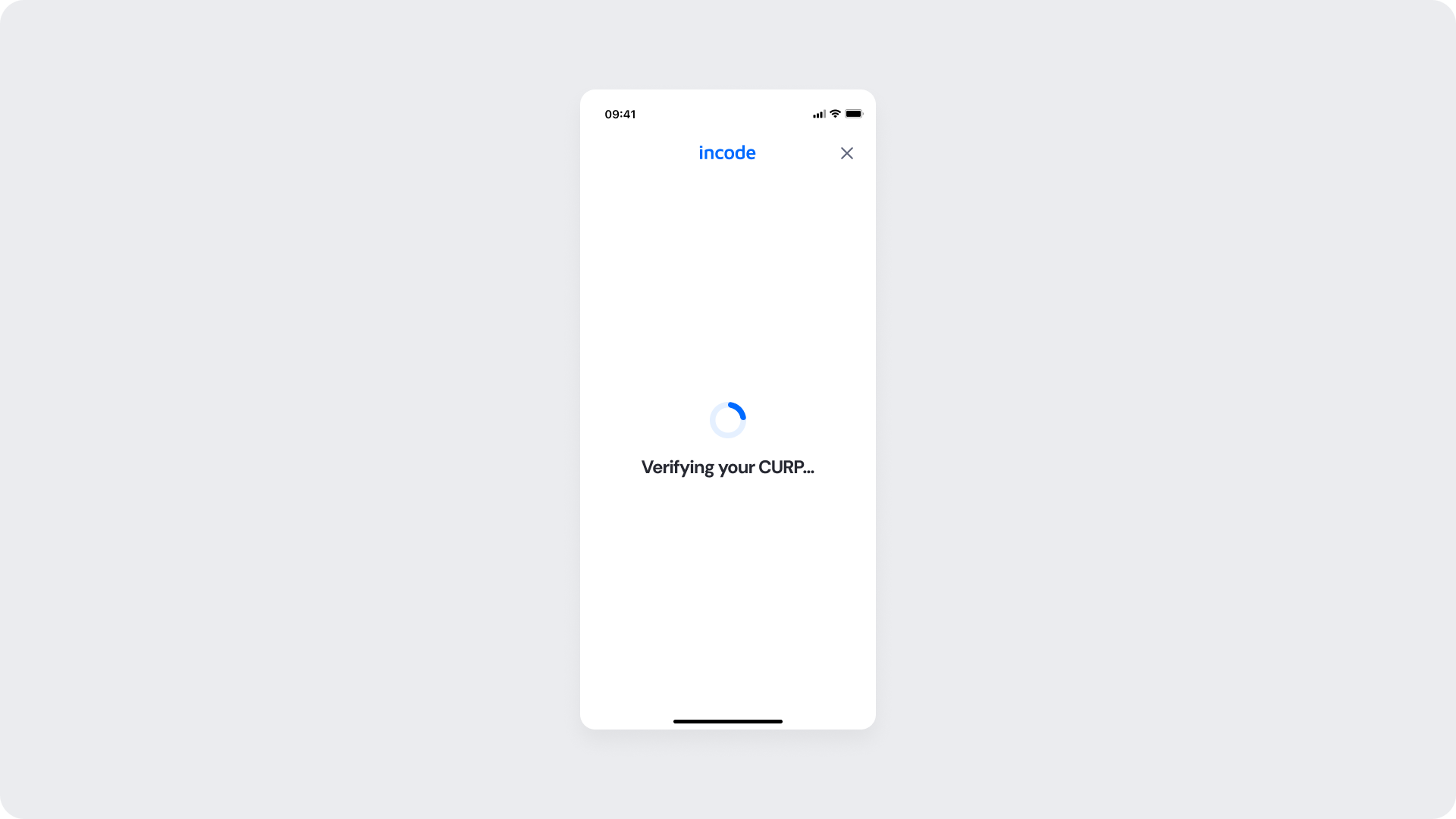
This screen appears after the user submits their CURP and validation is in progress. The entered value is locked and the primary action displays a loading indicator to communicate ongoing processing.
Once verification completes, the flow automatically transitions to the success or error state.
| Area | What can be customized | Notes |
|---|
| Text | Title, subtitle, button labels | Fully localizable |
| Brand Colors | Buttons, links, highlight elements | Uses brand tokens |
| Buttons | Label, color | Must follow platform and WCAG standards |
| Element | Why it is fixed |
|---|
| Layout structure | Keeps parity between web and native flows |
| Text hierarchy | Ensures clarity of instructions |
| Button placement | Optimized for quick completion |
| WCAG minimum contrast | Required for web accessibility standards |
| UI Element | Token | Raw Value |
|---|
| Title text (“Enter your CURP”) | text-body-primary | #262831 |
| Input text (disabled) | input-text-field-disabled | #82879A |
| Input surface (disabled) | input-surface-disabled | #EBECEF |
| Input border (disabled) | input-border-disabled / border-neutral-100 | #EBECEF |
| Background | surface-neutral-0 | #FFFFFF |
| Primary button background (disabled) | button-primary-surface-default | #006AFF |
| Primary button text | button-primary-text-default | #FFFFFF |
| Primary button loading indicator | surface-brand-400-static | #3388FF |
| Secondary button border (“I don’t have a CURP”) | button-secondary-border-default | #006AFF |
| Secondary button text | button-secondary-text-default / text-accent-brand | #006AFF |
- The loading indicator uses brand tokens to signal progress without breaking visual consistency.
- Primary and secondary actions maintain hierarchy through consistent button tokens.
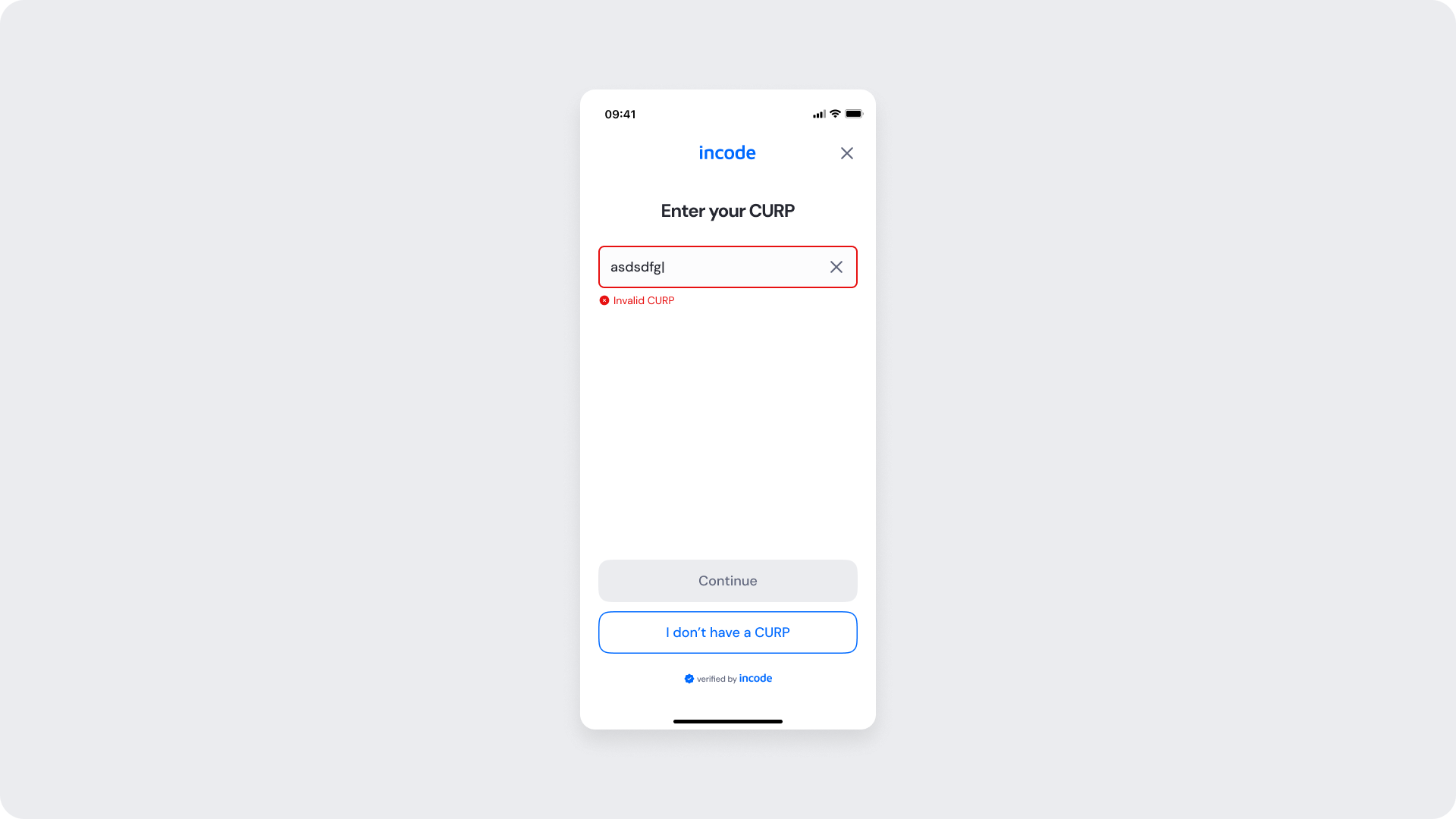
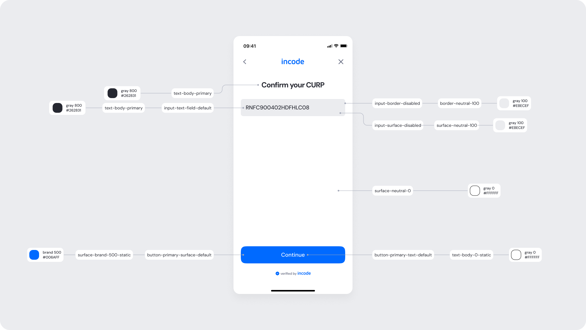
This state appears when the entered CURP does not meet the required format or validation rules. The input field is highlighted to indicate an error, and a clear message explains what needs to be corrected.
The primary action remains disabled until a valid CURP is provided, allowing the user to fix the input or choose an alternative path if available.
| Area | What can be customized | Notes |
|---|
| Text | Title, button label | Fully localizable |
| Brand Colors | Illustration accent, button background, highlights | Uses brand tokens |
| Buttons | Label and color | Must follow platform and WCAG standards |
| Element | Why it is fixed |
|---|
| Layout structure | Maintains consistency with other verification modules |
| Spacing & alignment | Optimized for layout consistency |
| Text hierarchy | Required for readability and hierarchy |
| Close icon position | Standardized for familiarity |
| WCAG minimum contrast | Required for web accessibility standards |
| UI Element | Token | Raw Value |
|---|
| Title text (“Enter your CURP”) | text-body-primary | #262831 |
| Input text (error) | input-text-field-default | #262831 |
| Input border (error) | input-border-negative / border-status-negative | #EF4444 |
| Input surface (error) | input-surface-negative / surface-neutral-100 | #EBECEF |
| Error icon | icon-status-negative | #EF4444 |
| Error message text (“Invalid CURP”) | text-status-negative | #EF4444 |
| Background | surface-neutral-0 | #FFFFFF |
| Primary button background (disabled) | button-primary-surface-disabled | #EBECEF |
| Primary button text (disabled) | button-primary-text-disabled | #9CA3AF |
| Secondary button border (“I don’t have a CURP”) | button-secondary-border-default | #006AFF |
| Secondary button text | button-secondary-text-default / text-accent-brand | #006AFF |
- Error states uses semantic error tokens (border, text, icon) to communicate validation clearly and consistenly.
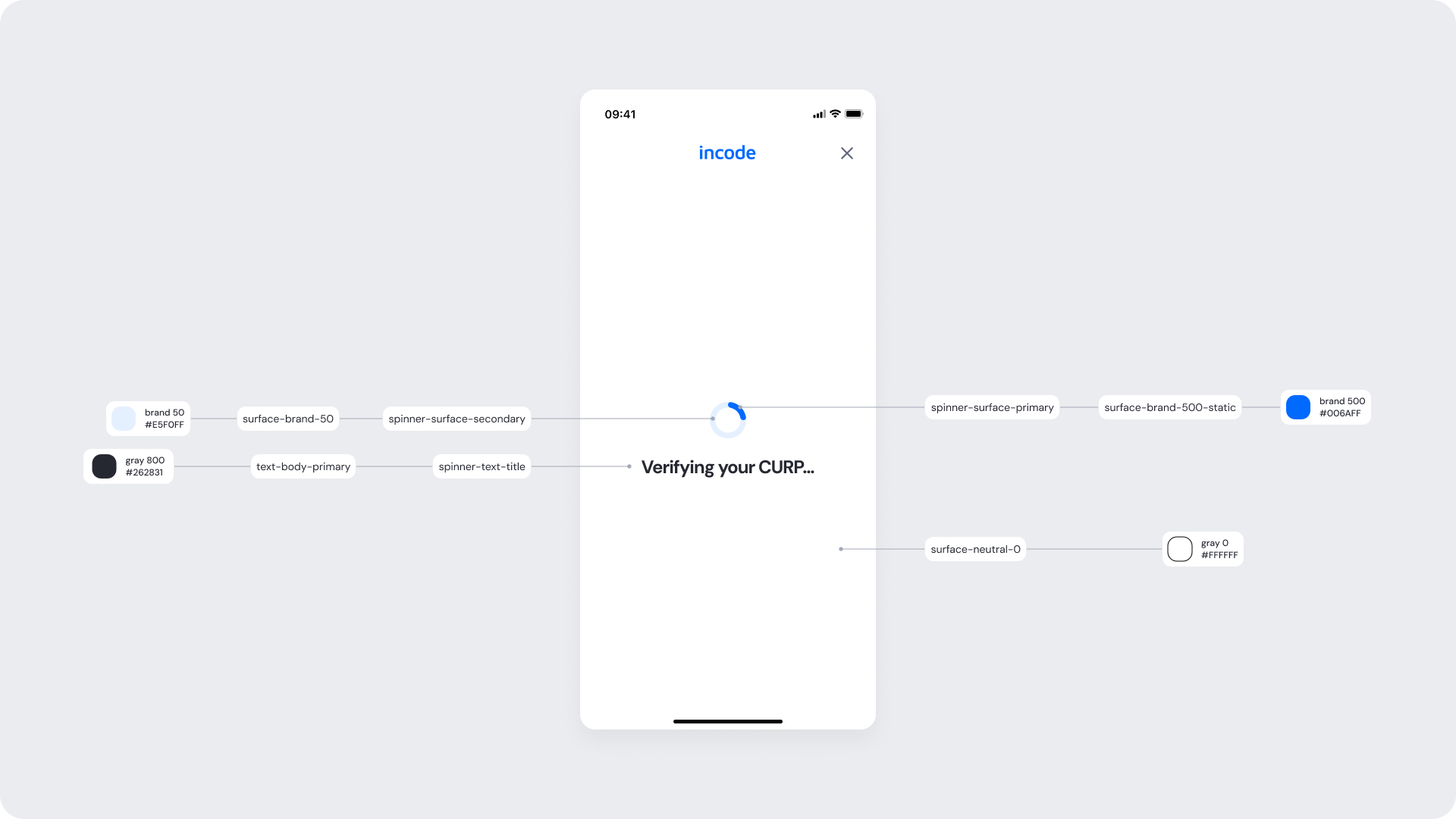
Shown after the user submits their CURP. The system validates the identifier and displays a processing state while verification is in progress.
Once validation completes, the flow automatically proceeds to the success or error state.
| Area | What can be customized | Notes |
|---|
| Text | Title, button label | Fully localizable |
| Illustration | Colors or full replacement | Must clearly represent location confirmation |
| Brand Colors | Illustration accent, button background, highlights | Uses brand tokens |
| Element | Why it is fixed |
|---|
| Layout structure | Maintains consistency with other verification modules |
| Spacing & alignment | Optimized for layout consistency |
| Text hierarchy | Required for readability and hierarchy |
| Close icon position | Standardized for familiarity |
| WCAG minimum contrast | Required for web accessibility standards |
| UI Element | Token | Raw Value |
|---|
| Screen background | surface-neutral-0 | #FFFFFF |
| Close icon | icon-neutral-500 | #60667C |
| Loading spinner (primary surface) | spinner-surface-primary / surface-brand-500-static | #006AFF |
| Loading spinner (secondary surface) | spinner-surface-secondary / surface-brand-50 | #E6F0FF |
| Spinner text (“Verifying your CURP…”) | spinner-text-title / text-body-primary | #262831 |
| Status bar icons | icon-neutral-500 | #60667C |
- The loading state removes interactive elements to prevent user interruption during verification.
- A centered circular progress indicator communicates system activity using brand tokens.
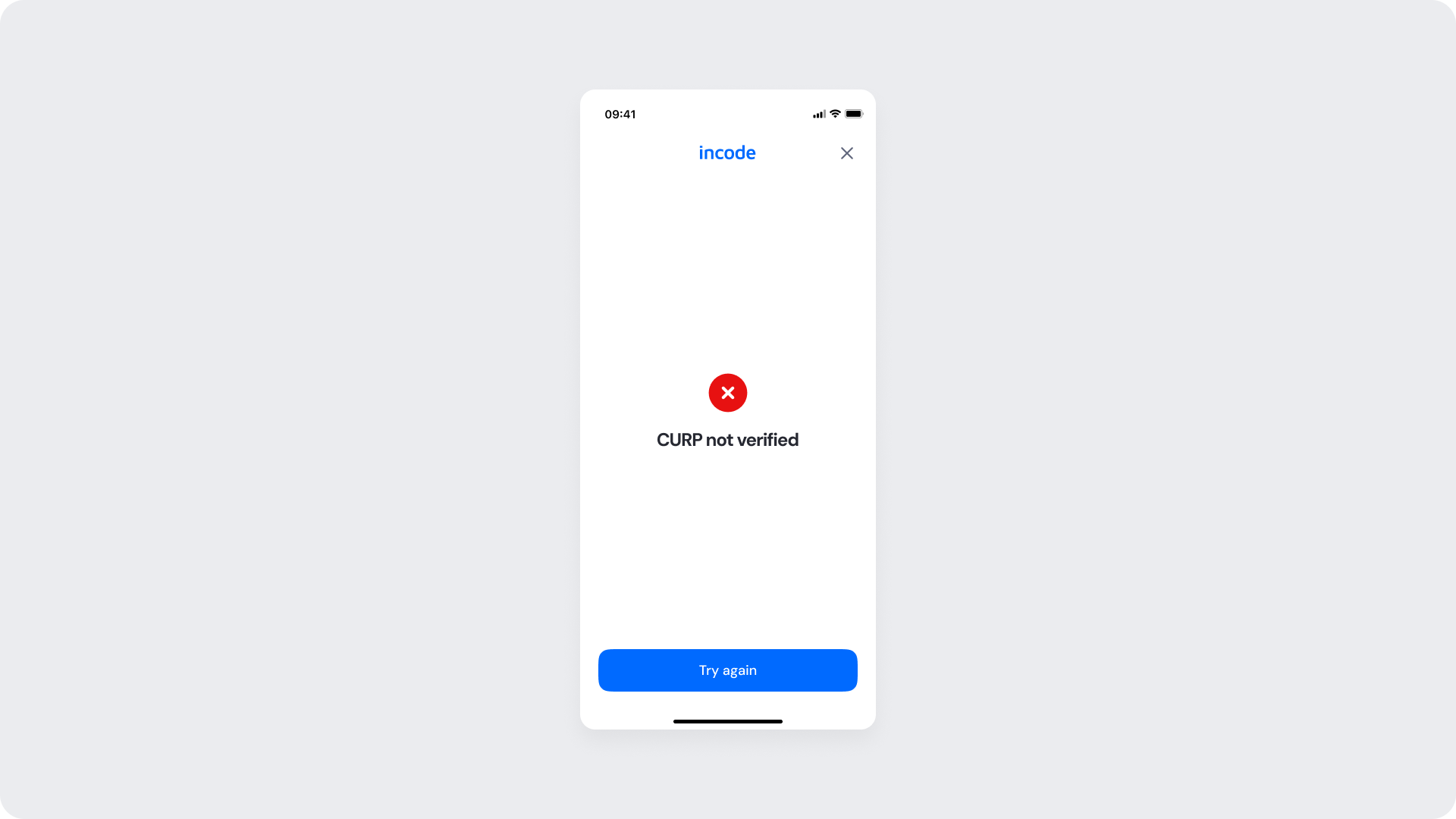
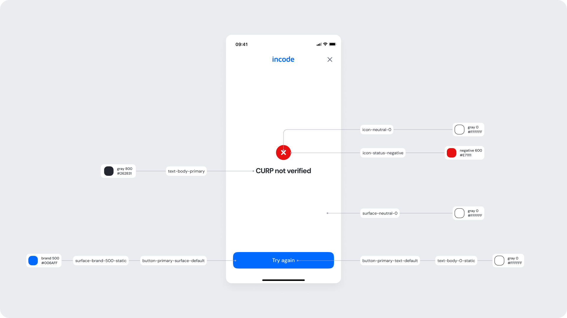
Shown when verification fails due to incomplete or invalid data, or due to a mismatch with the official database. The user can review and edit their input, or retry the process.
| Area | What can be customized | Notes |
|---|
| Text | Title, button label | Fully localizable |
| Brand Colors | Illustration accent, button background, highlights | Uses brand tokens |
| Buttons | Label and color | Must follow platform and WCAG standards |
| Element | Why it is fixed |
|---|
| Layout structure | Maintains consistency with other verification modules |
| Spacing & alignment | Optimized for layout consistency |
| Text hierarchy | Required for readability and hierarchy |
| Close icon position | Standardized for familiarity |
| WCAG minimum contrast | Required for web accessibility standards |
| UI Element | Token | Raw Value |
|---|
| Screen background | surface-neutral-0 | #FFFFFF |
| Status icon (error) | icon-status-negative | #EF4444 |
| Status text (“CURP not verified”) | text-body-primary | #262831 |
| Primary button background (“Try again”) | button-primary-surface-default | #006AFF |
| Primary button text | button-primary-text-default | #FFFFFF |
| Status bar icons | icon-neutral-500 | #60667C |
- A semantic error token is used for the icon to ensure immediate recognition of failure.
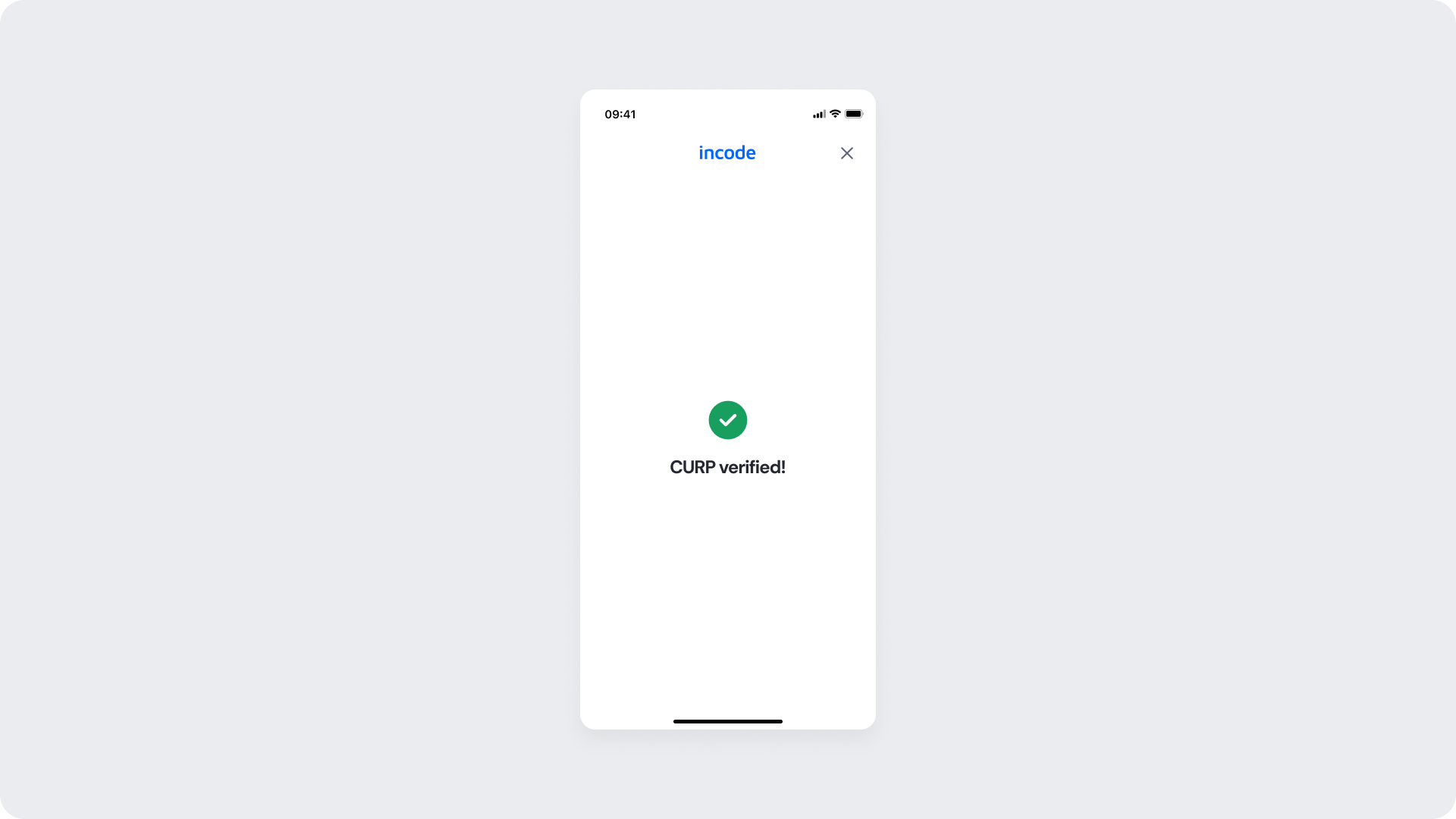
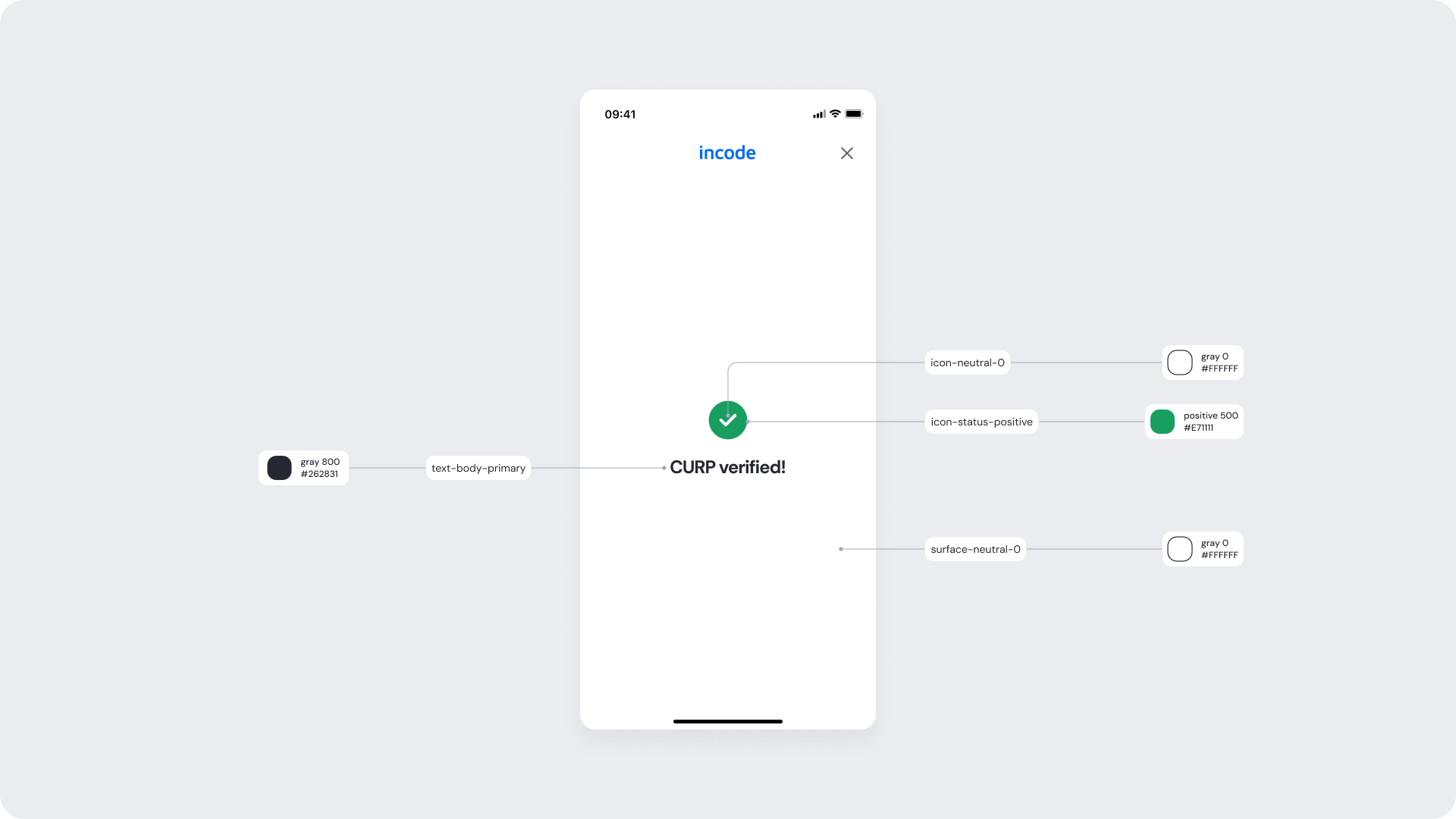
Displayed when the CURP is successfully verified. The user can proceed to the next step in the onboarding or identity flow.
| Area | What can be customized | Notes |
|---|
| Text | Title, button label | Fully localizable |
| Brand Colors | Illustration accent, button background, highlights | Uses brand tokens |
| Buttons | Label and color | Must follow platform and WCAG standards |
| Element | Why it is fixed |
|---|
| Layout structure | Maintains consistency with other verification modules |
| Spacing & alignment | Optimized for layout consistency |
| Text hierarchy | Required for readability and hierarchy |
| Close icon position | Standardized for familiarity |
| WCAG minimum contrast | Required for web accessibility standards |
| UI Element | Token | Raw Value |
|---|
| Screen background | surface-neutral-0 | #FFFFFF |
| Status icon (success) | icon-status-positive | #22C55E |
| Status text (“CURP verified!”) | text-body-primary | #262831 |
| Status bar icons | icon-neutral-500 | #60667C |
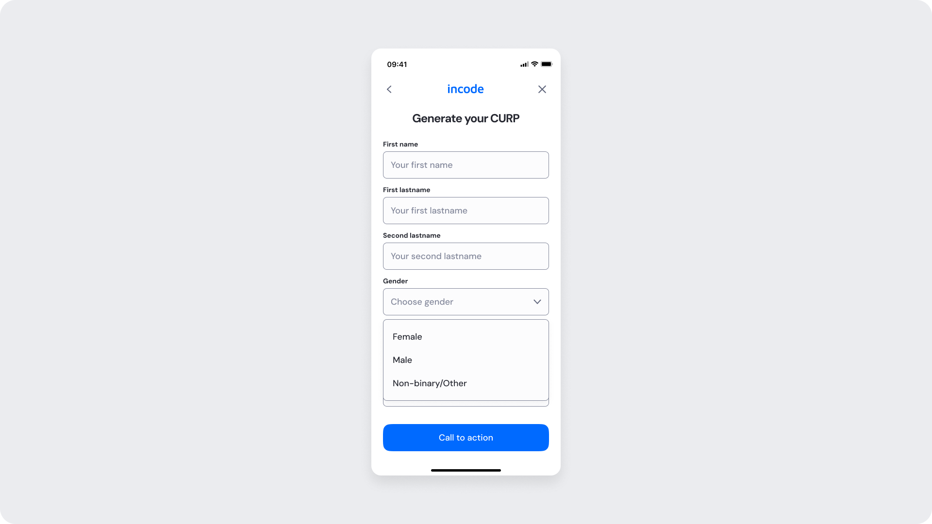
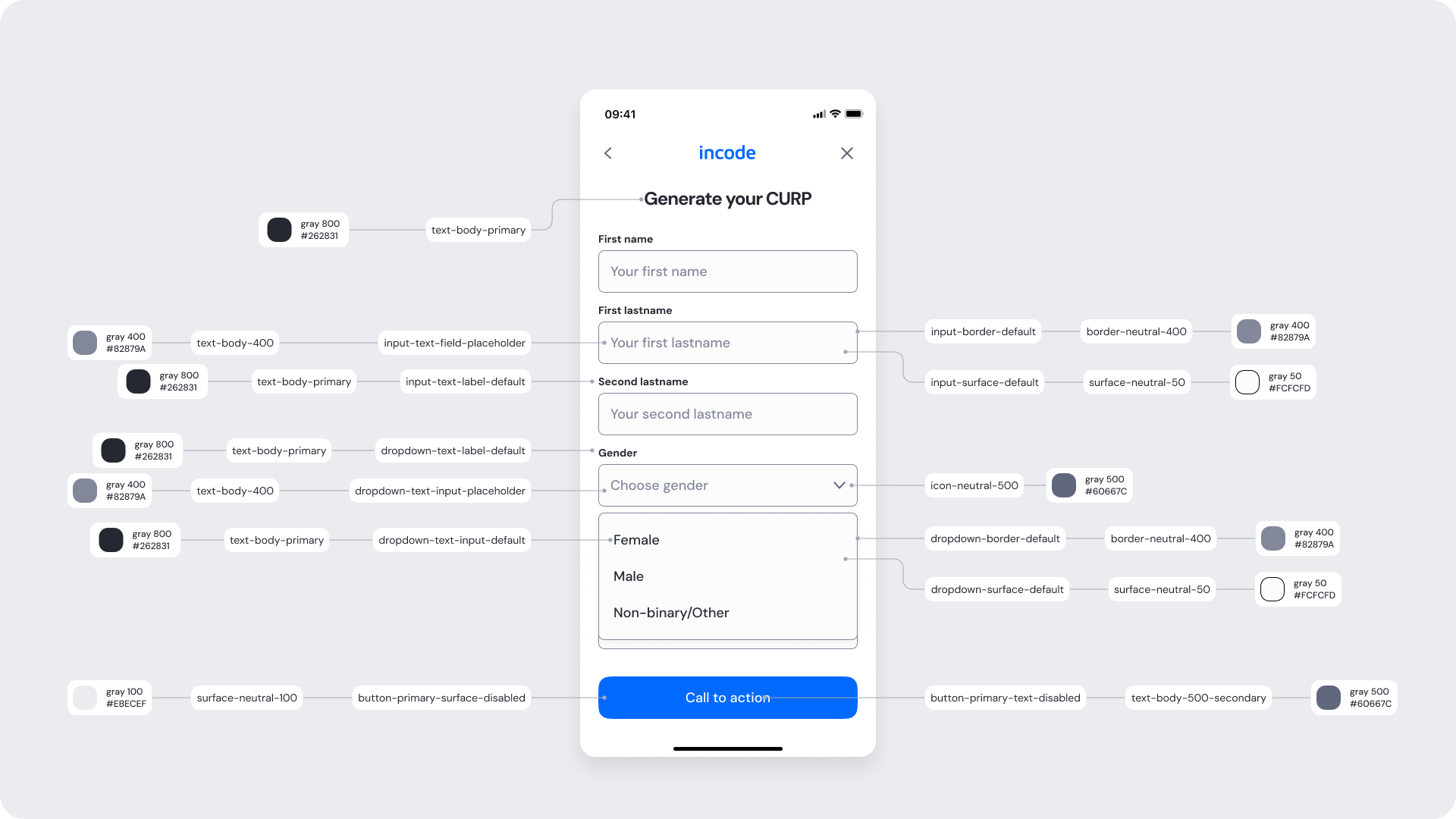
Allows the user to generate a CURP if they don't have one, by manually entering personal details.
| Area | What can be customized | Notes |
|---|
| Text | Title, button label | Fully localizable |
| Brand Colors | Illustration accent, button background, highlights | Uses brand tokens |
| Buttons | Label and color | Must follow platform and WCAG standards |
| Element | Why it is fixed |
|---|
| Layout structure | Maintains consistency with other verification modules |
| Spacing & alignment | Optimized for layout consistency |
| Text hierarchy | Required for readability and hierarchy |
| Close icon position | Standardized for familiarity |
| WCAG minimum contrast | Required for web accessibility standards |
| UI Element | Token | Raw Value |
|---|
| Screen title (“Generate your CURP”) | text-body-primary | #262831 |
| Close / Back icons | icon-neutral-500 | #60667C |
| Screen background | surface-neutral-0 | #FFFFFF |
| Text field label | text-body-secondary | #60667C |
| Text field placeholder | input-text-field-placeholder | #82879A |
| Text field input text | text-body-primary | #262831 |
| Input surface (default) | input-surface-default | #FCFCFD |
| Input border (default) | input-border-default / border-neutral-100 | #E5E7EB |
| Dropdown surface (default) | dropdown-surface-default | #FFFFFF |
| Dropdown border (default) | dropdown-border-default / border-neutral-400 | #D1D5DB |
| Dropdown placeholder text | dropdown-text-input-placeholder | #82879A |
| Dropdown selected text | dropdown-text-input-default | #262831 |
| Dropdown icon | icon-neutral-500 | #60667C |
| Primary button background (“Call to action”) | button-primary-surface-default | #006AFF |
| Primary button text | button-primary-text-default | #FFFFFF |
| Primary button (disabled state) | button-primary-surface-disabled | #EBECEF |
| Primary button text (disabled) | button-primary-text-disabled | #9CA3AF |
- The screen follows a structured single-column form layout to support step-by-step data entry.
- Input fields use consistent input tokens to reinfoce visual uniformity.
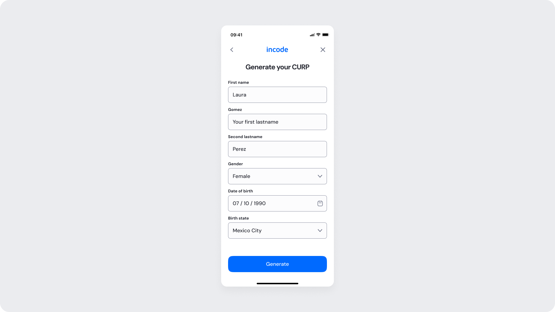
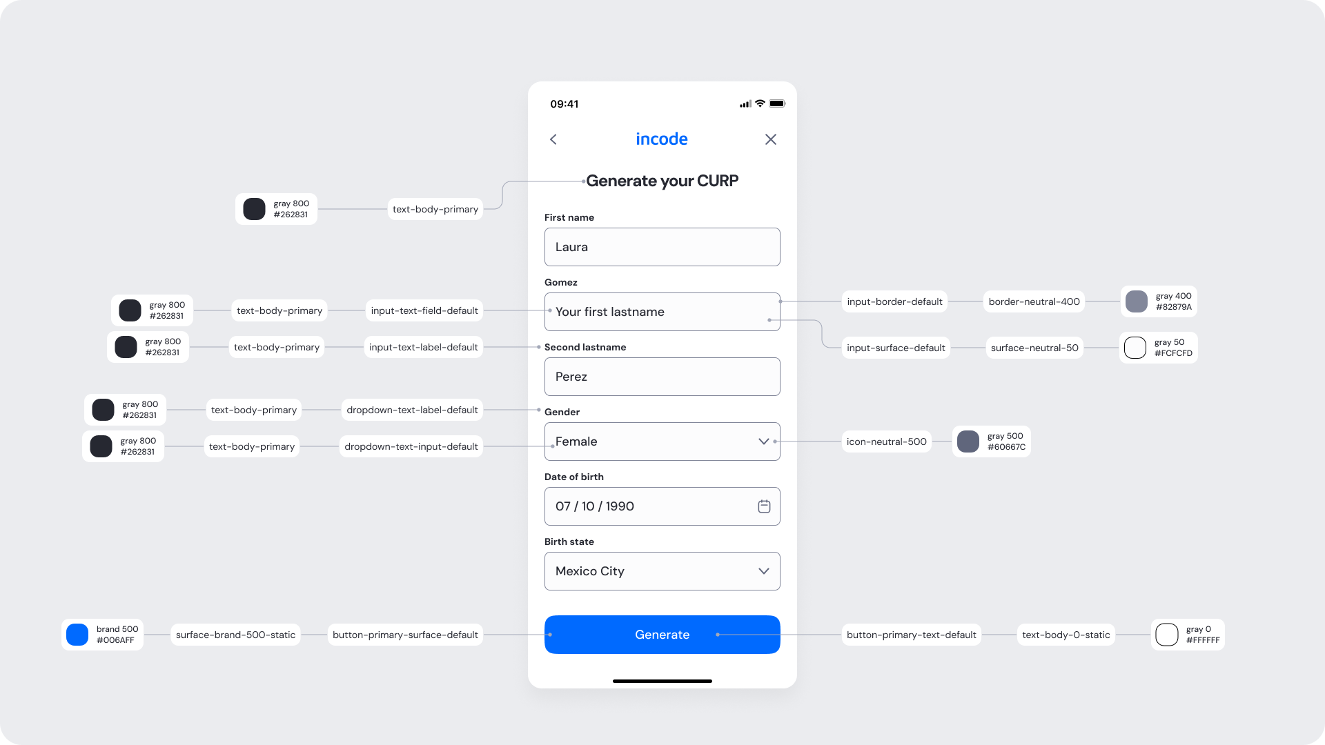
Shows the form with all required fields completed and ready to generate the CURP.
| Area | What can be customized | Notes |
|---|
| Text | Title, button label | Fully localizable |
| Brand Colors | Illustration accent, button background, highlights | Uses brand tokens |
| Buttons | Label and color | Must follow platform and WCAG standards |
| Element | Why it is fixed |
|---|
| Layout structure | Maintains consistency with other verification modules |
| Spacing & alignment | Optimized for layout consistency |
| Text hierarchy | Required for readability and hierarchy |
| Close icon position | Standardized for familiarity |
| WCAG minimum contrast | Required for web accessibility standards |
| UI Element | Token | Raw Value |
|---|
| Screen title (“Generate your CURP”) | text-body-primary | #262831 |
| Close / Back icons | icon-neutral-500 | #60667C |
| Screen background | surface-neutral-0 | #FFFFFF |
| Input label text | text-body-primary | #262831 |
| Input text (filled) | input-text-field-default / text-body-primary | #262831 |
| Input surface (default) | input-surface-default | #FCFCFD |
| Input border (default) | input-border-default / border-neutral-400 | #D1D5DB |
| Dropdown surface (default) | dropdown-surface-default | #FFFFFF |
| Dropdown border (default) | dropdown-border-default / border-neutral-400 | #D1D5DB |
| Dropdown selected text | dropdown-text-input-default | #262831 |
| Dropdown icon | icon-neutral-500 | #60667C |
| Primary button background (“Generate”) | button-primary-surface-default | #006AFF |
| Primary button text | button-primary-text-default | #FFFFFF |
| Status bar icons | icon-neutral-500 | #60667C |
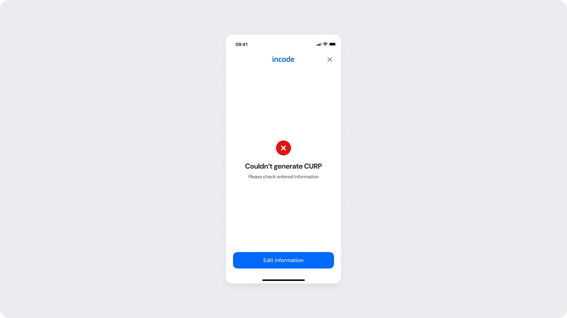
Shown when verification fails due to incomplete or invalid data, or due to a mismatch with the official database. The user can review and edit their input, or retry the process..
| Area | What can be customized | Notes |
|---|
| Text | Title, button label | Fully localizable |
| Brand Colors | button background | Uses brand tokens |
| Buttons | Label and color | Must follow platform and WCAG standards |
| Element | Why it is fixed |
|---|
| Layout structure | Maintains consistency with other verification modules |
| Spacing & alignment | Optimized for layout consistency |
| Text hierarchy | Required for readability and hierarchy |
| Close icon position | Standardized for familiarity |
| WCAG minimum contrast | Required for web accessibility standards |
| UI Element | Token | Raw Value |
|---|
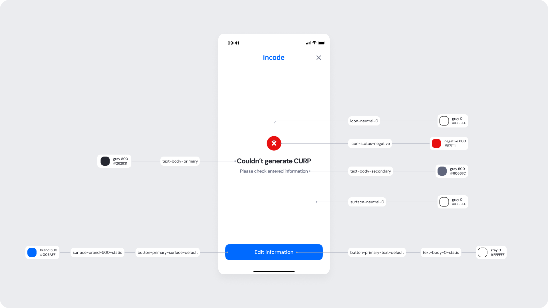
| Status icon (error) | icon-status-negative | #EF4444 |
| Title text (“Couldn’t generate CURP”) | text-body-primary | #262831 |
| Supporting text (“Please check entered information”) | text-body-secondary | #60667C |
| Screen background | surface-neutral-0 | #FFFFFF |
| Primary button background (“Edit information”) | button-primary-surface-default | #006AFF |
| Primary button text | button-primary-text-default | #FFFFFF |
- The result state uses a centered status layout to clearly communicate system feedback.
- A semantic error token (red) is applied to the icon to ensure immediate visual recognition.
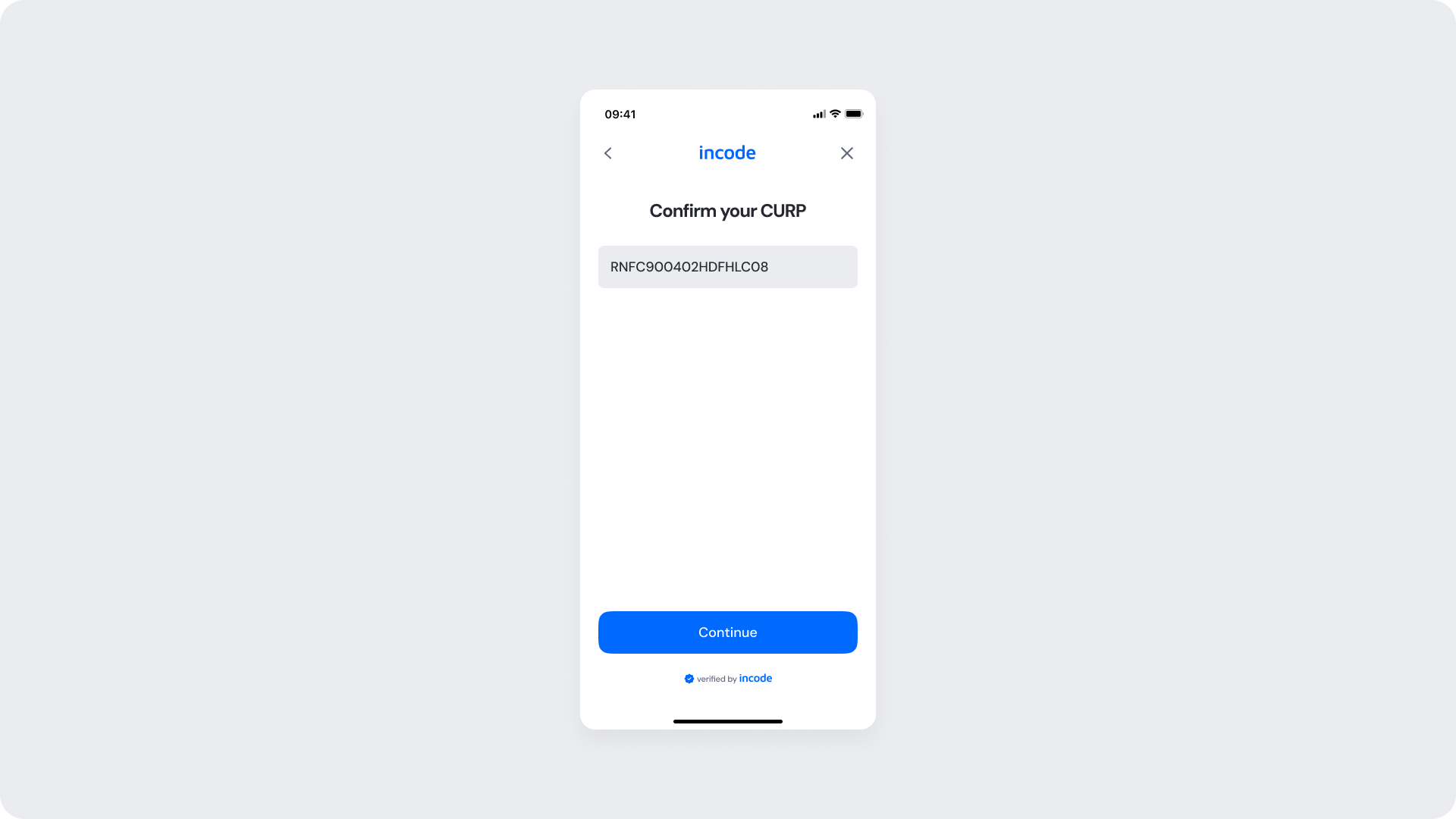
Displays the generated CURP for review before submission. The user can confirm or go back to edit details.
| Area | What can be customized | Notes |
|---|
| Text | Title, button label | Fully localizable |
| Brand Colors | button background | Uses brand tokens |
| Buttons | Label and color | Must follow platform and WCAG standards |
| Element | Why it is fixed |
|---|
| Layout structure | Maintains consistency with other verification modules |
| Spacing & alignment | Optimized for layout consistency |
| Text hierarchy | Required for readability and hierarchy |
| Close icon position | Standardized for familiarity |
| WCAG minimum contrast | Required for web accessibility standards |
| UI Element | Raw Value | Token |
|---|
| Title text (“Confirm your CURP”) | #262831 | text-body-primary |
| CURP input text | #262831 | input-text-field-default |
| Input border (disabled) | #EBECEF | input-border-disabled |
| Input surface (disabled) | #EBECEF | input-surface-disabled |
| Screen background | #FFFFFF | surface-neutral-0 |
| Primary button background (“Continue”) | #006AFF | button-primary-surface-default |
| Primary button text | #FFFFFF | button-primary-text-default |