
Specs & Guidelines
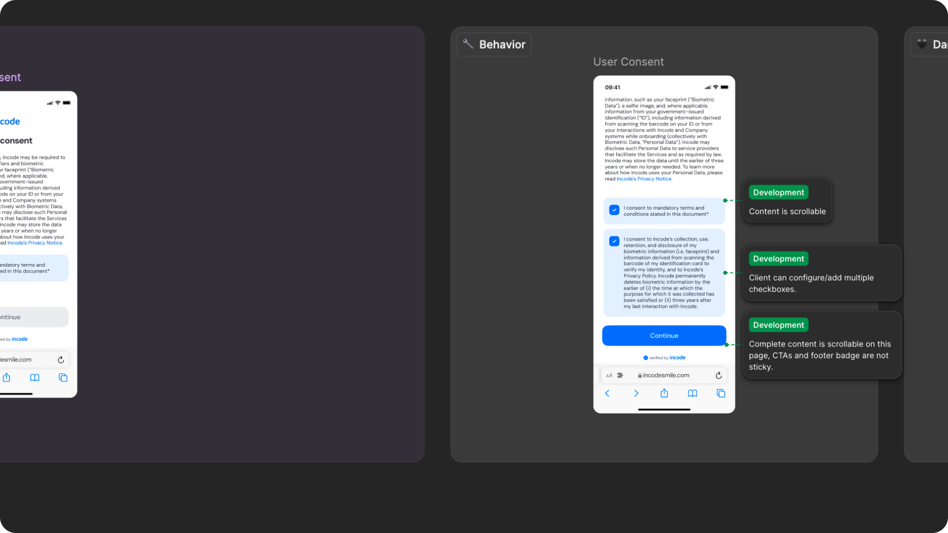
The Data Sharing Consent module includes complete Figma specifications documenting spacing, layout behavior, typography tokens, consent content variations, and localization requirements. These specifications ensure a consistent experience across platforms while allowing organizations to customize consent messaging, branding elements, and data-sharing disclosures without impacting usability, accessibility, or layout integrity.
Responsiveness & Viewport Adaptation
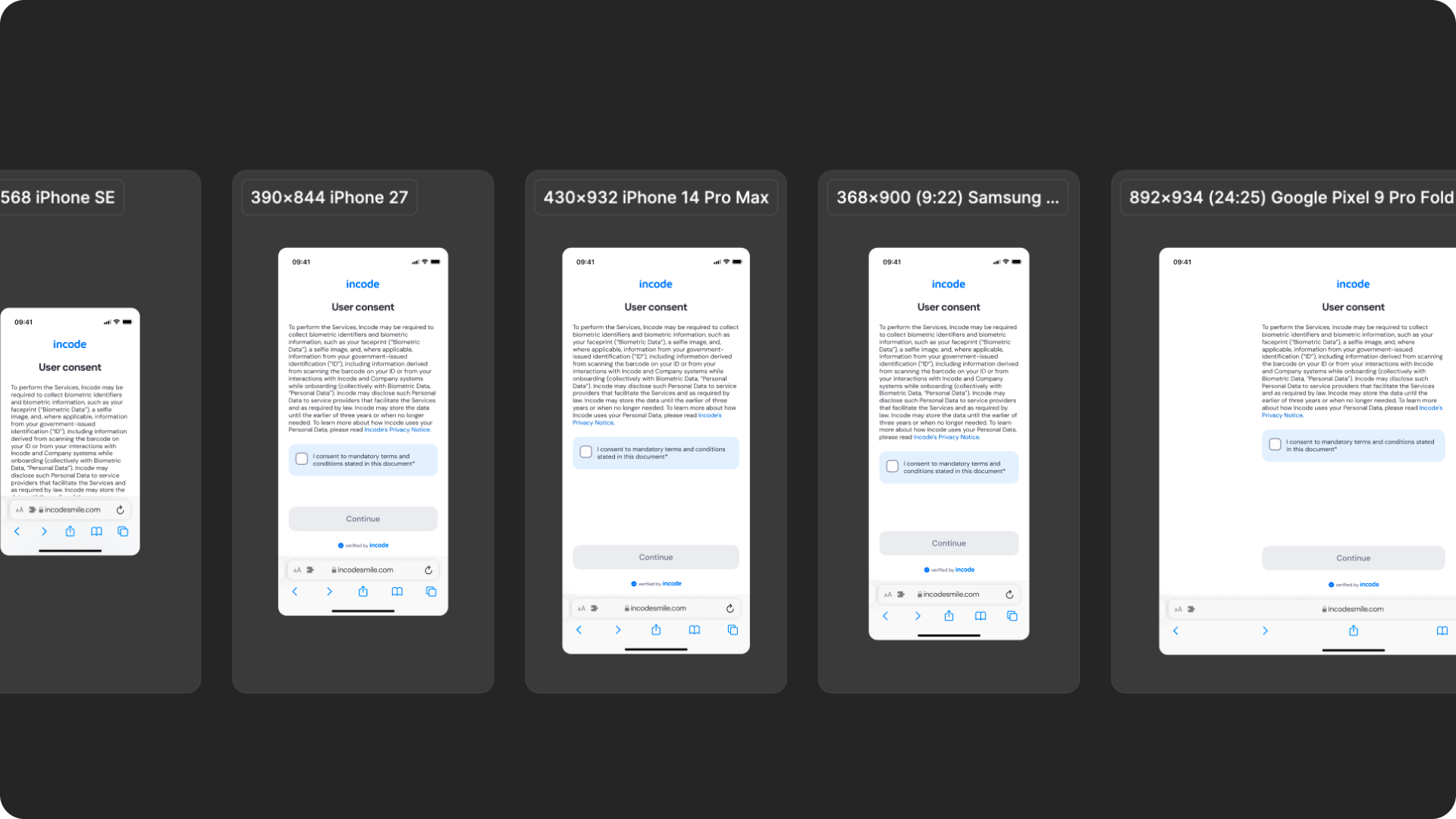
The Data Sharing Consent module is fully responsive and adapts seamlessly to a wide range of device sizes and aspect ratios. The layout is designed to remain readable and accessible whether users are completing the consent flow on a small phone, large phone, foldable device, tablet, or desktop browser.
This ensures that consent information, disclosure text, checkboxes, and action buttons remain visible, accessible, and properly aligned across platforms.
How the layout adapts across devices
| Breakpoint | Behavior |
|---|---|
| Small phones (e.g., iPhone SE) | Consent content scrolls vertically while maintaining readable spacing and accessible tap targets |
| Standard phones (iPhone 12–16) | Full layout displayed with consistent hierarchy, spacing, and content organization |
| Tall/narrow Android devices | Vertical spacing adapts to preserve readability and keep consent actions visible |
| Foldables (e.g., Pixel Fold) | Additional whitespace improves readability while keeping consent content centered |
| Tablets | Increased margins and content width while maintaining comfortable reading lengths |
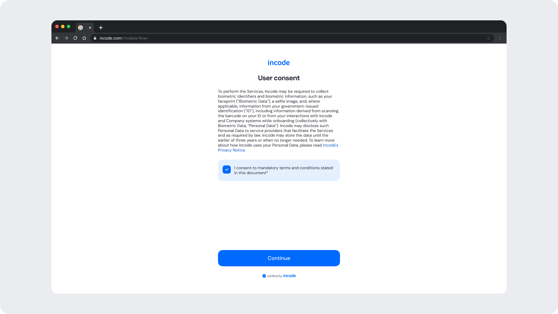
| Desktop web | Centered layout with controlled max-width and additional safe area spacing |
What is responsive (and customizable)
| Element | Responsive Behavior | Customizable |
|---|---|---|
| Consent content | Reflows based on viewport width and available space | Yes |
| Consent disclosure text | Supports multiline expansion and scrolling when needed | Yes |
| Checkbox area | Expands vertically to accommodate localized content | Checkbox text only |
| Buttons | Width adjusts to available container space | Color, label, radius |
| Footer / watermark | Remains aligned within the bottom safe area | Optional |
| Header / branding area | Adjusts spacing based on safe areas and viewport size | Limited |
What remains fixed across breakpoints
| Element | Reason |
|---|---|
| Consent flow structure | Ensures a predictable and compliant consent experience |
| Checkbox interaction behavior | Required for explicit consent capture |
| Minimum text size | Required for readability and accessibility compliance |
| Minimum tap target sizes | Ensures accessibility across devices |
| Content hierarchy | Preserves comprehension of consent information |
| Required consent actions | Prevents bypassing mandatory consent requirements |
Design Notes
- Consent content should remain easy to scan and understand regardless of screen size.
- Avoid introducing custom layouts that disrupt the reading flow or consent hierarchy.
- Long localized text is supported, but content should remain concise whenever possible.
- Maintain clear separation between disclosure content, consent actions, and primary CTAs.
Desktop & Tablet Guidelines
The module is fully responsive and adapts gracefully to larger viewports. The Figma file includes guidelines for layout adjustments, safe areas, proportion scaling, and interaction differences between touch and pointer-based devices.
Prototype & Transitions
The Data Sharing Consent module includes predefined interaction patterns and transitions covering consent review, consent confirmation, and progression to the next verification step.
Localization
The Data Sharing Consent module supports full localization and is designed to adapt to languages with different lengths, line breaks, and reading patterns. The Figma file includes examples for long, short, and multi-line translations to ensure layouts remain stable across regions.
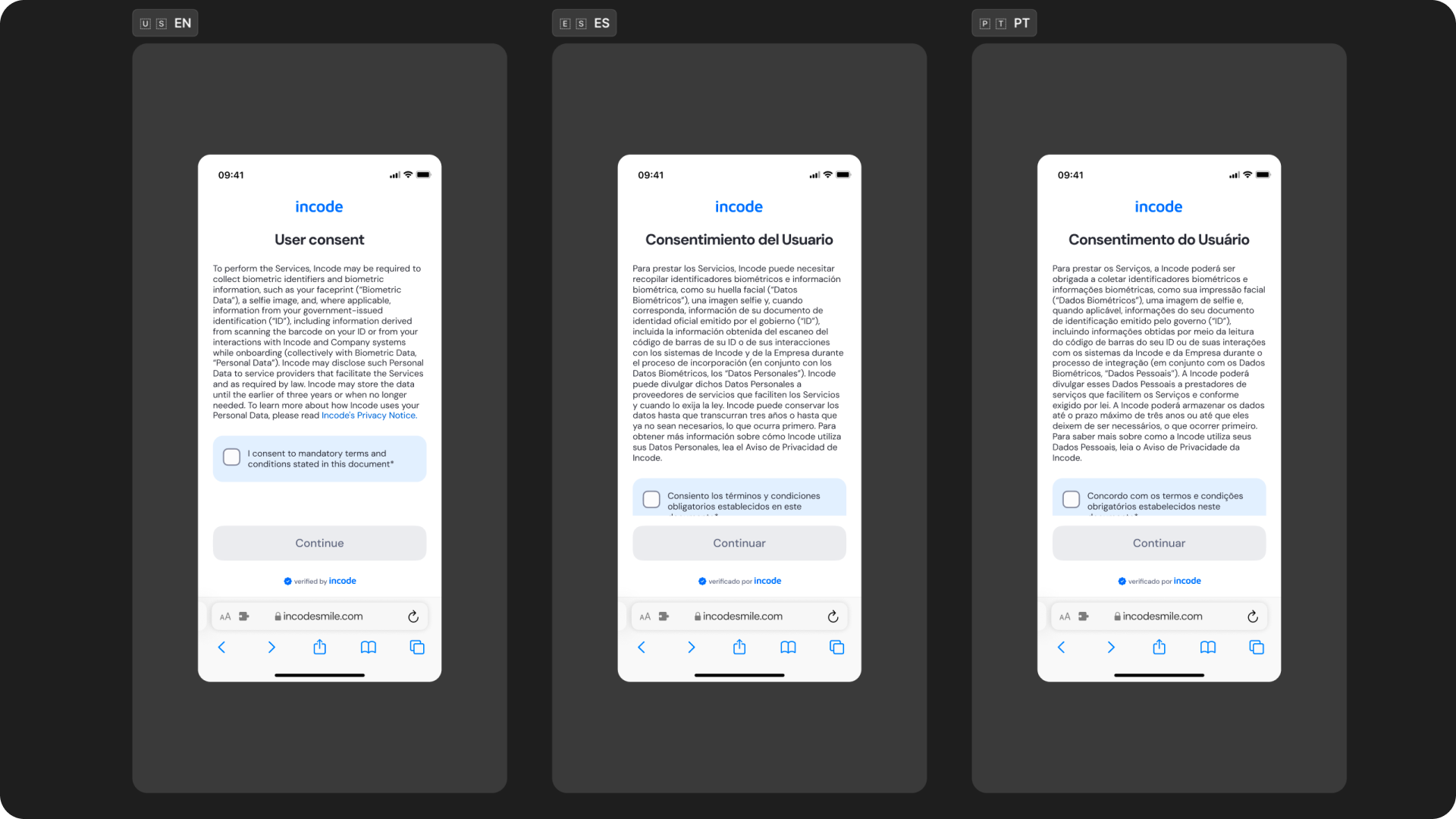
Key considerations:
- All user-facing text is fully localizable.
- UI adjusts to prevent truncation and maintain readability.
- Spacing and vertical rhythm adapt to accommodate longer languages.
- Buttons and CTAs automatically expand to fit translated labels.
- Ensure localized strings preserve clarity and follow regulatory requirements when applicable.
- Incode supports a variety of languages
Updated about 1 month ago