This section outlines the elements you can customize within the Manual Upload ID module to match your brand while preserving Incode's core UX. It clarifies which areas are flexible, such as text, tab labels, and brand colors, and which elements remain fixed to ensure consistency, accessibility, and reliable document processing across platforms.
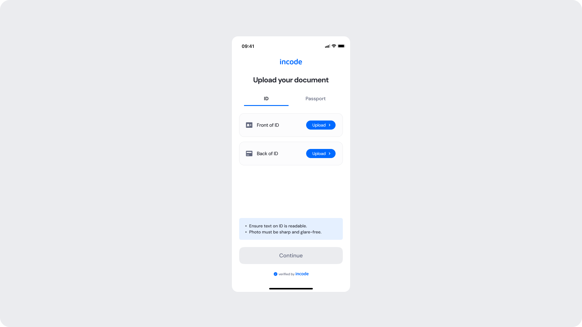
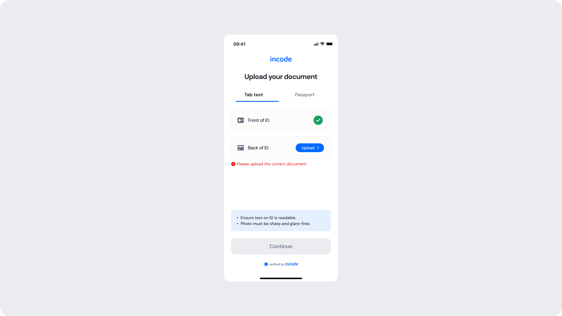
The Upload Your Document screen is where the user selects their document type and uploads the front and back sides of their identity document. It presents upload prompts per document side, image quality hints, and a disabled Continue button that activates only once all required sides have been validated.
| Area | What can be customized | Notes |
|---|
| Text | Title, subtitle, tab labels, upload row labels, hint text | Fully localizable; tone can be adapted to your brand voice. |
| Button — Upload | Label, color, radius | Must follow platform guidelines. |
| Button — Continue | Label, color, radius (active and disabled states) | Must follow platform guidelines. |
| Background Color | Screen background | Must maintain strong contrast with text and elements. |
| Brand Colors | Header text, tab indicator, accent color | Uses brand tokens. |
| Footer | "Verified by Incode" line | Optional but recommended for trust and product consistency. |
| Element | Why it is fixed |
|---|
| Continue button disabled state | Must remain inactive until all required document sides are validated. |
| Upload row structure | Required to ensure both document sides are collected consistently. |
| Component spacing & safe areas | Required for device compatibility and visual stability. |
| Text hierarchy | Optimized to communicate requirements clearly. |
| WCAG contrast requirements | Mandatory for accessibility and regulatory compliance. |
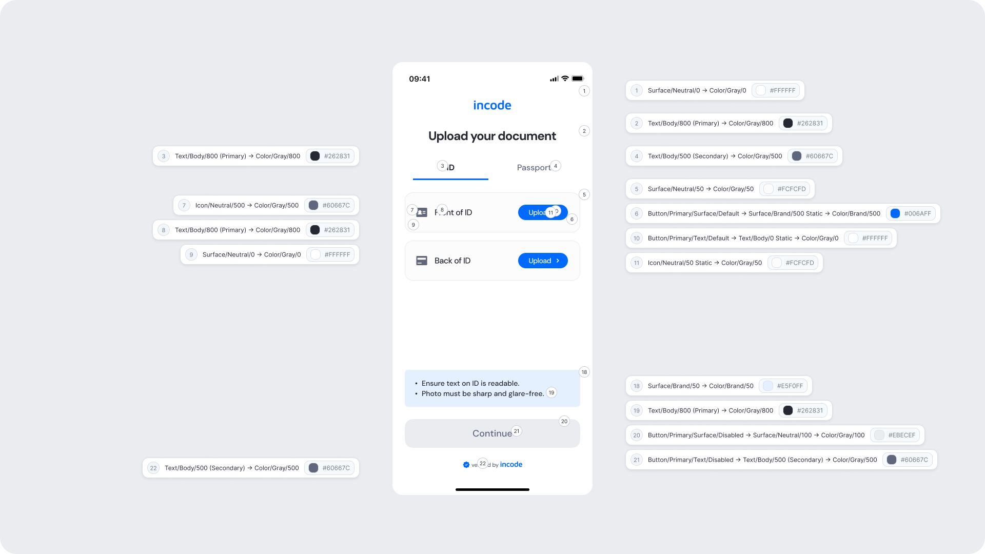
| UI Element | Token | Value |
|---|
| Background | Surface/Neutral/0 → Color/Gray/0 | #FFFFFF |
| Title text | Text/Body/800 (Primary) → Color/Gray/800 | #262831 |
| Tab label (active) | Text/Body/800 (Primary) → Color/Gray/800 | #262831 |
| Tab label (inactive) | Text/Body/500 (Secondary) → Color/Gray/500 | #60667C |
| Upload row background | Surface/Neutral/50 → Color/Gray/50 | #FCFCFD |
| Upload button background | Button/Primary/Surface/Default → Surface/Brand/500 Static → Color/Brand/500 | #006AFF |
| Upload button text | Button/Primary/Text/Default → Text/Body/0 Static → Color/Gray/0 | #FFFFFF |
| Upload row icon | Icon/Neutral/50 Static → Color/Gray/50 | #FCFCFD |
| Row label text | Text/Body/800 (Primary) → Color/Gray/800 | #262831 |
| Row icon | Icon/Neutral/500 → Color/Gray/500 | #60667C |
| Close icon | Surface/Neutral/0 → Color/Gray/0 | #FFFFFF |
| Hint area background | Surface/Brand/50 → Color/Brand/50 | #E5F0FF |
| Hint text | Text/Body/800 (Primary) → Color/Gray/800 | #262831 |
| Continue button background (disabled) | Button/Primary/Surface/Disabled → Surface/Neutral/100 → Color/Gray/100 | #EBECEF |
| Continue button text (disabled) | Button/Primary/Text/Disabled → Text/Body/500 (Secondary) → Color/Gray/500 | #60667C |
| Footer text | Text/Body/500 (Secondary) → Color/Gray/500 | #60667C |
- Keep instructions clear about what document sides are required and the expected image quality.
- The Continue button must stay visually distinct in its disabled state to communicate that action is still required.
- Ensure tap targets on Upload buttons meet accessibility guidelines.
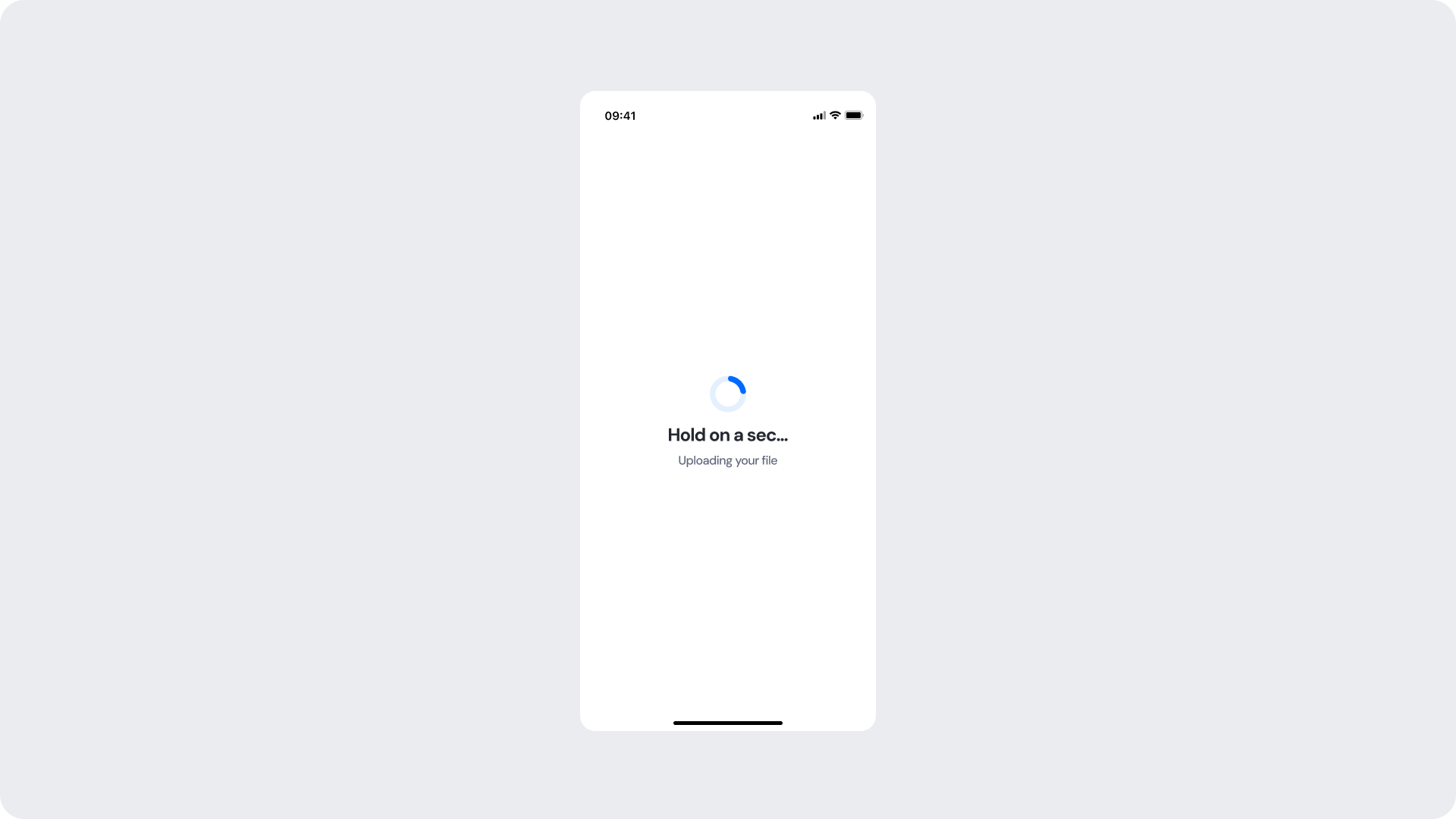
This screen appears while a selected file is being uploaded to the system. A spinner and a status message keep the user informed while the operation completes in the background.
| Area | What can be customized | Notes |
|---|
| Title text | Loading message ("Hold on a sec...") | Fully localizable; should remain concise. |
| Subtitle text | Supporting message ("Uploading your file") | Tone can match your brand voice; optional. |
| Spinner accent color | Primary spinner stroke | Uses brand tokens; must remain visually clear. |
| Spinner background color | Secondary spinner stroke | Should maintain contrast with accent. |
| Background Color | Screen background | Must preserve readability and contrast. |
| Element | Why it is fixed |
|---|
| Processing flow timing | Linked to backend processing; cannot be shortened or skipped. |
| Spinner animation style | Standardized across SDK for performance and recognizability. |
| Spacing & safe areas | Required for device consistency. |
| Minimum contrast | Required for accessibility and compliance. |
| UI Element | Token | Value |
|---|
| Background | Surface/Neutral/Light → Color/Neutral/light | #FFFFFF |
| Spinner background | Spinner/surface/secondary → Surface/Primary/50 → Color/Brand/50 | #E5F0FF |
| Spinner accent | Spinner/surface/primary → Surface/Primary/500 → Color/Brand/500 | #006AFF |
| Title text | Spinner/text/title → Text/Body/primary → Color/Gray/800 | #262831 |
| Subtitle text | Spinner/text/subtitle → Text/Body/secondary → Color/Gray/500 | #60667C |
- Keep copy short to minimize cognitive load during the wait.
- Use subtitle text to set user expectations about what is happening.
- Avoid adding imagery or additional UI elements that may distract from the upload state.
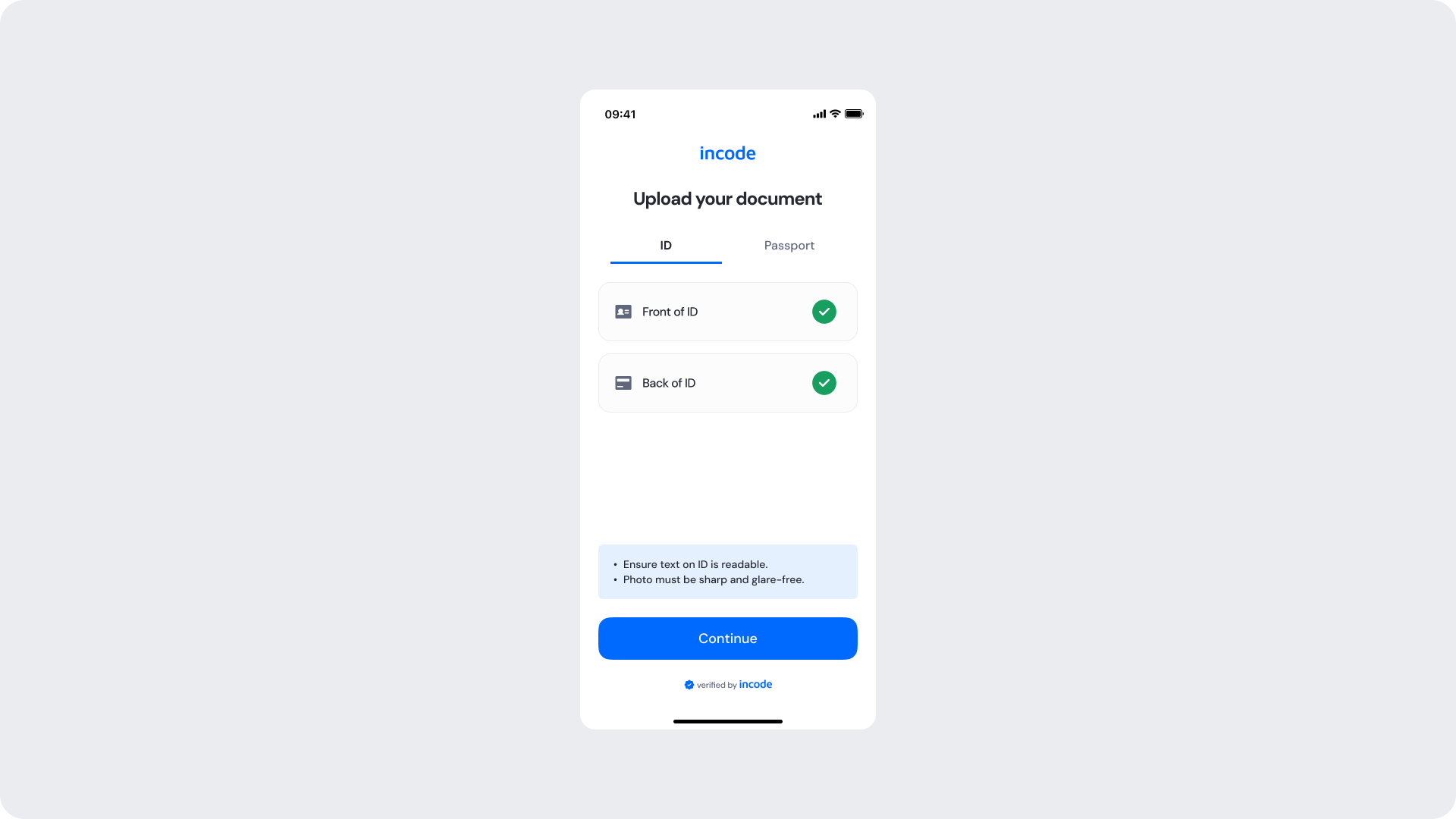
Shown once both document sides have been successfully uploaded and validated with a green checkmark per side. The Continue button becomes active, allowing the user to proceed to the verification step.
| Area | What can be customized | Notes |
|---|
| Text | Title, subtitle, tab labels, row labels, hint text | Fully localizable. |
| Success indicator icon | Green checkmark per row | Can replace with custom success icon; must remain clearly positive. |
| Button — Continue | Label, color, radius | Must follow platform guidelines. |
| Background Color | Screen background | Must maintain contrast with content. |
| Brand Colors | Header text, tab indicator, accent color | Uses brand tokens. |
| Footer | "Verified by Incode" line | Optional but recommended. |
| Element | Why it is fixed |
|---|
| Success logic per row | Must reflect actual validation result per document side. |
| Status color mapping | Green = positive; required for consistent semantics. |
| Continue button active state | Only activates when all sides are validated; cannot be bypassed. |
| Button placement | Standardized across modules. |
| WCAG contrast requirements | Mandatory for accessibility and regulatory compliance. |
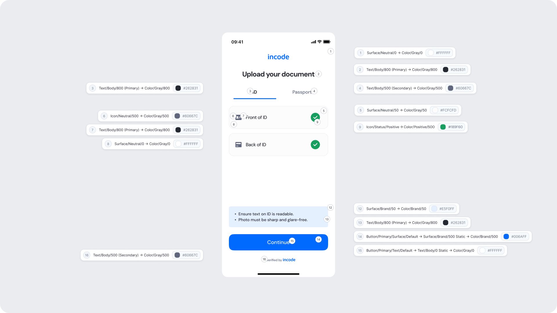
| UI Element | Token | Value |
|---|
| Background | Surface/Neutral/0 → Color/Gray/0 | #FFFFFF |
| Title text | Text/Body/800 (Primary) → Color/Gray/800 | #262831 |
| Tab label (active) | Text/Body/800 (Primary) → Color/Gray/800 | #262831 |
| Tab label (inactive) | Text/Body/500 (Secondary) → Color/Gray/500 | #60667C |
| Row background | Surface/Neutral/50 → Color/Gray/50 | #FCFCFD |
| Row icon | Icon/Neutral/500 → Color/Gray/500 | #60667C |
| Row label text | Text/Body/800 (Primary) → Color/Gray/800 | #262831 |
| Close icon | Surface/Neutral/0 → Color/Gray/0 | #FFFFFF |
| Success icon | Icon/Status/Positive → Color/Positive/500 | #189F60 |
| Hint area background | Surface/Brand/50 → Color/Brand/50 | #E5F0FF |
| Hint text | Text/Body/800 (Primary) → Color/Gray/800 | #262831 |
| Continue button background | Button/Primary/Surface/Default → Surface/Brand/500 Static → Color/Brand/500 | #006AFF |
| Continue button text | Button/Primary/Text/Default → Text/Body/0 Static → Color/Gray/0 | #FFFFFF |
| Footer text | Text/Body/500 (Secondary) → Color/Gray/500 | #60667C |
- The green checkmark per row gives users clear, per-side confirmation without requiring them to re-read the full screen.
- Ensure the Continue button uses the brand 500 color to provide a clear and prominent next step.
- Maintain visual consistency between the upload and validated states of each row.
Error screens appear inline within the upload flow when a document side is rejected or an incorrect file is submitted. The user is notified with a clear message directly below the affected upload row and prompted to upload the correct document. The Continue button remains disabled until the issue is resolved.
| Area | What can be customized | Notes |
|---|
| Title text | Screen title | Fully localizable. |
| Tab labels | Document type tab labels | Fully localizable. |
| Error message text | Inline error message ("Please upload the correct document") | Fully localizable; tone should be neutral and non-blaming. |
| Error icon | Inline error indicator | Can be replaced; must remain clearly negative. |
| Button — Upload | Label, color, radius | Action should guide the user to retry with the correct file. |
| Background color | Screen background | Must support strong contrast. |
| Brand Colors | Header text, tab indicator | Uses brand tokens. |
| Footer | "Verified by Incode" line | Optional but recommended. |
| Element | Why it is fixed |
|---|
| Error logic | Must accurately reflect the document validation result. |
| Status color mapping | Red = negative; required for clarity and consistency. |
| Continue button disabled state | Cannot advance until the error is resolved. |
| Inline error placement | Positioned directly below the affected row for clear attribution. |
| Button placement | Consistent across modules. |
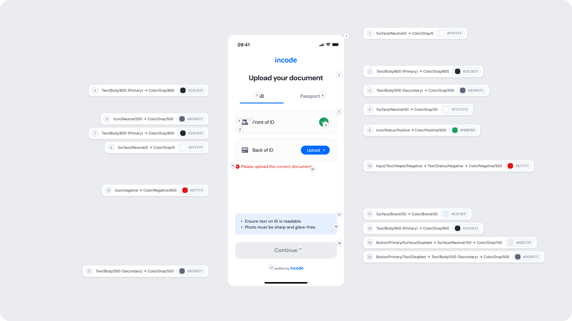
| UI Element | Token | Value |
|---|
| Background | Surface/Neutral/0 → Color/Gray/0 | #FFFFFF |
| Title text | Text/Body/800 (Primary) → Color/Gray/800 | #262831 |
| Tab label (active) | Text/Body/800 (Primary) → Color/Gray/800 | #262831 |
| Tab label (inactive) | Text/Body/500 (Secondary) → Color/Gray/500 | #60667C |
| Row background | Surface/Neutral/50 → Color/Gray/50 | #FCFCFD |
| Row icon | Icon/Neutral/500 → Color/Gray/500 | #60667C |
| Row label text | Text/Body/800 (Primary) → Color/Gray/800 | #262831 |
| Success icon (validated row) | Icon/Status/Positive → Color/Positive/500 | #189F60 |
| Error icon | Icon/negative → Color/Negative/600 | #E71111 |
| Inline error text | Input/Text/Helper/Negative → Text/Status/Negative → Color/Negative/500 | #E71111 |
| Hint area background | Surface/Brand/50 → Color/Brand/50 | #E5F0FF |
| Hint text | Text/Body/800 (Primary) → Color/Gray/800 | #262831 |
| Continue button background (disabled) | Button/Primary/Surface/Disabled → Surface/Neutral/100 → Color/Gray/100 | #EBECEF |
| Continue button text (disabled) | Button/Primary/Text/Disabled → Text/Body/500 (Secondary) → Color/Gray/500 | #60667C |
| Footer text | Text/Body/500 (Secondary) → Color/Gray/500 | #60667C |
- Error messaging should be clear, direct, and action-oriented.
- Inline placement of the error message directly below the affected row ensures users understand exactly which side needs to be corrected.
- Maintain consistent spacing and visual hierarchy for readability.
- Avoid technical language; users should understand the issue at a glance.